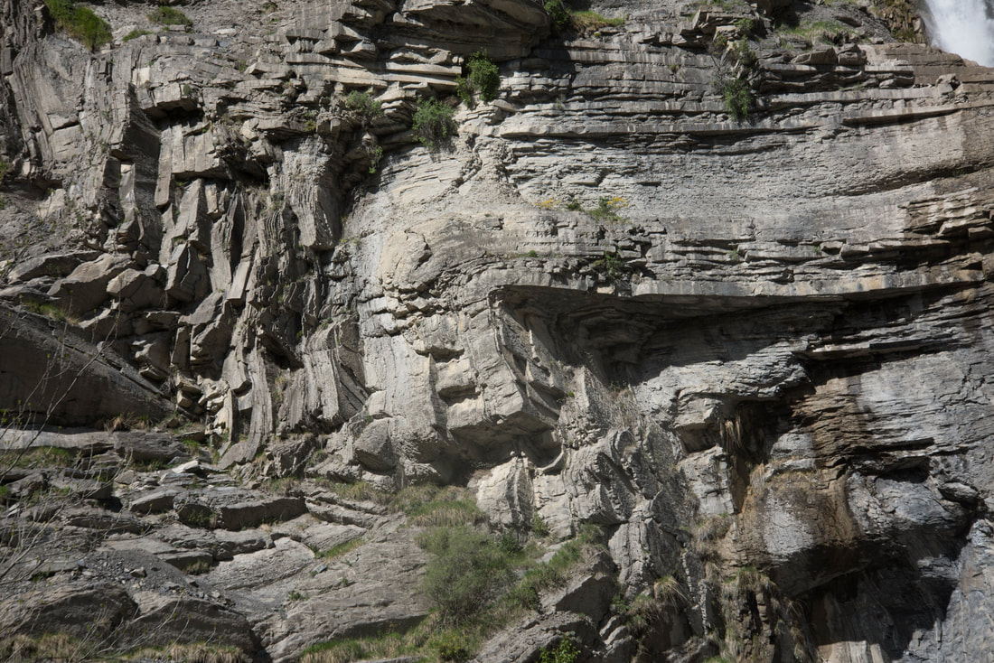
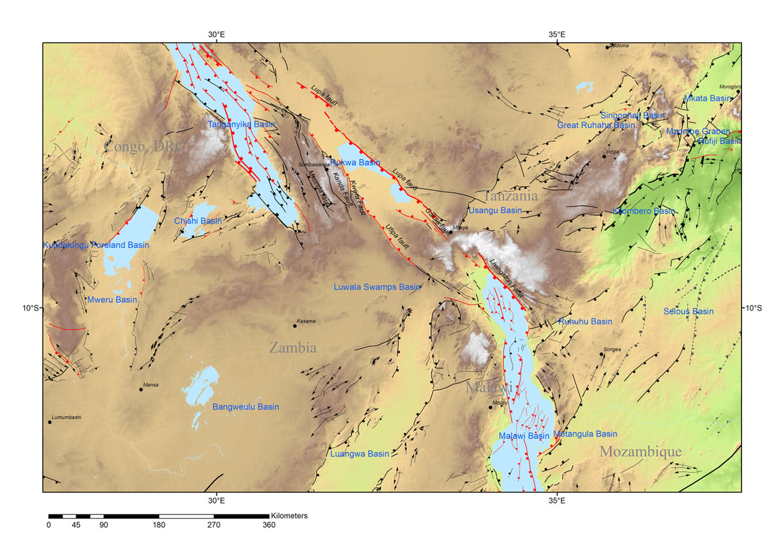
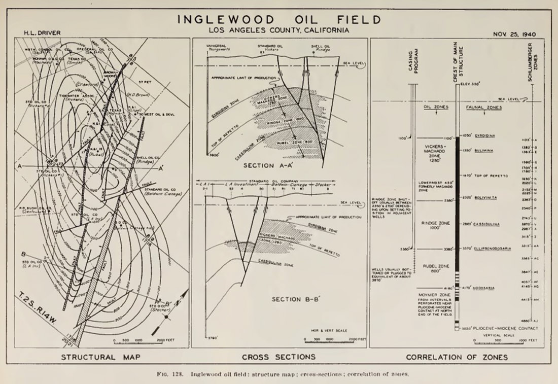
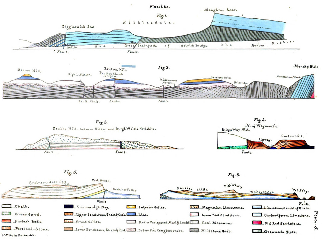
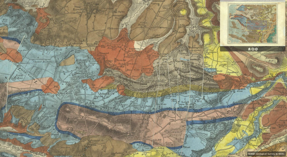
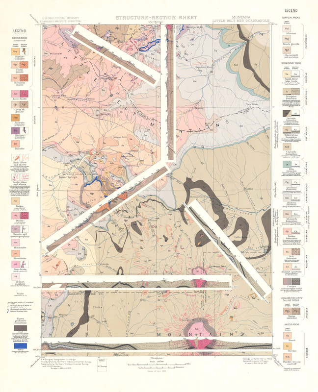
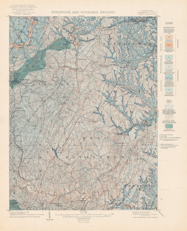
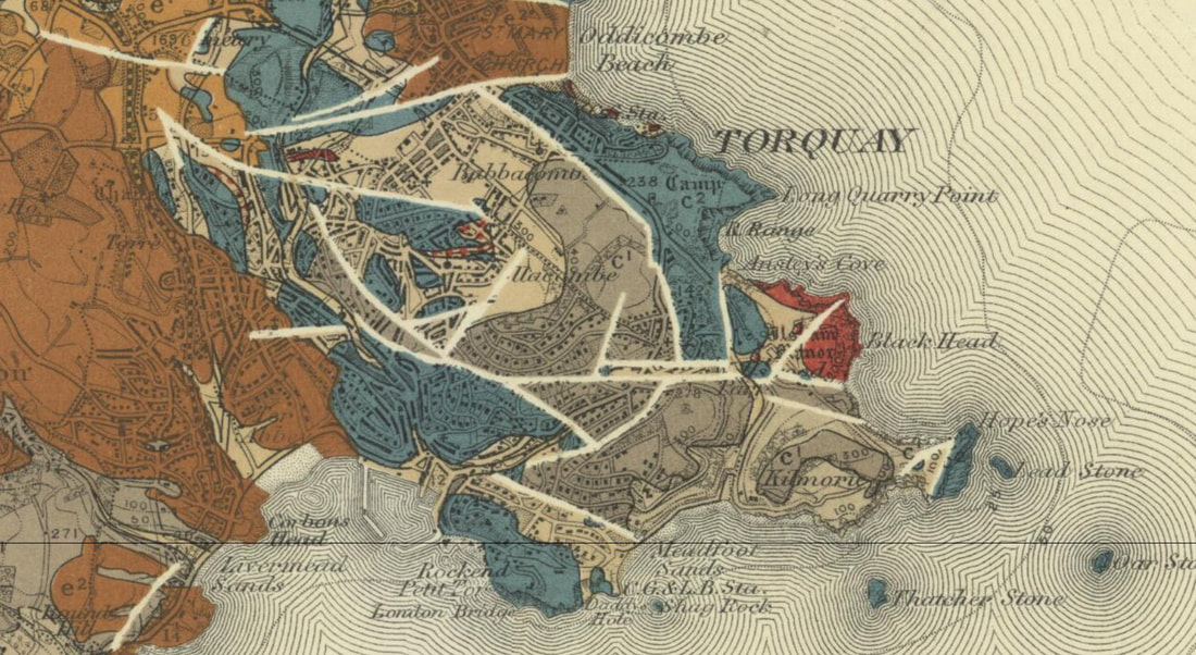
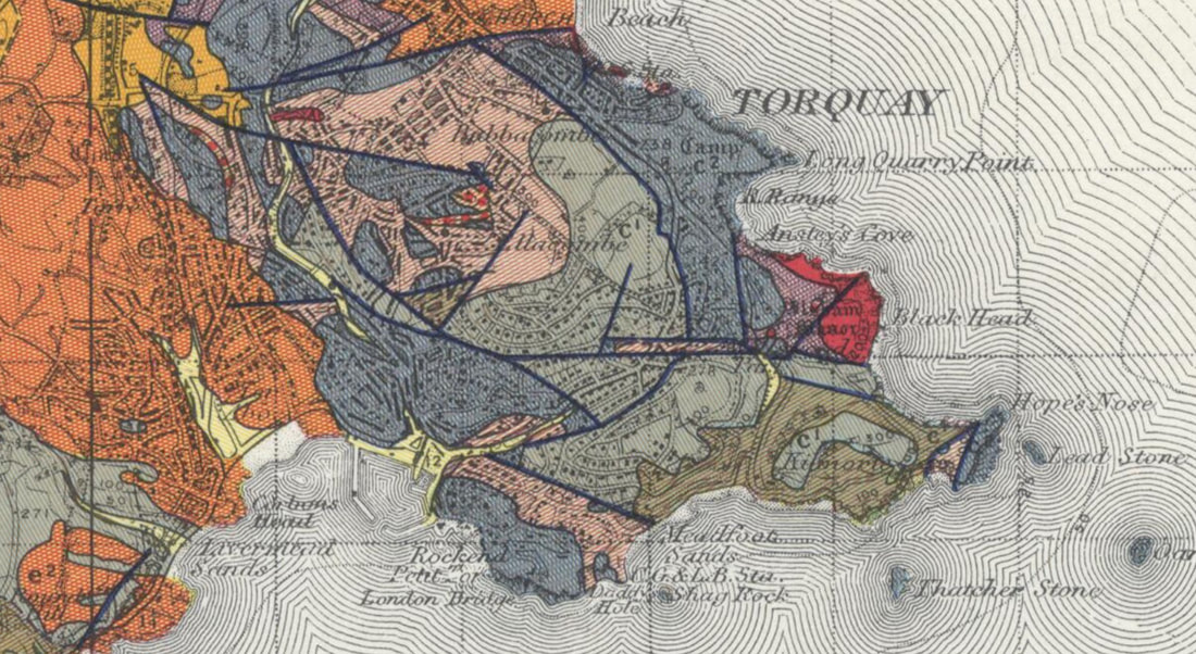
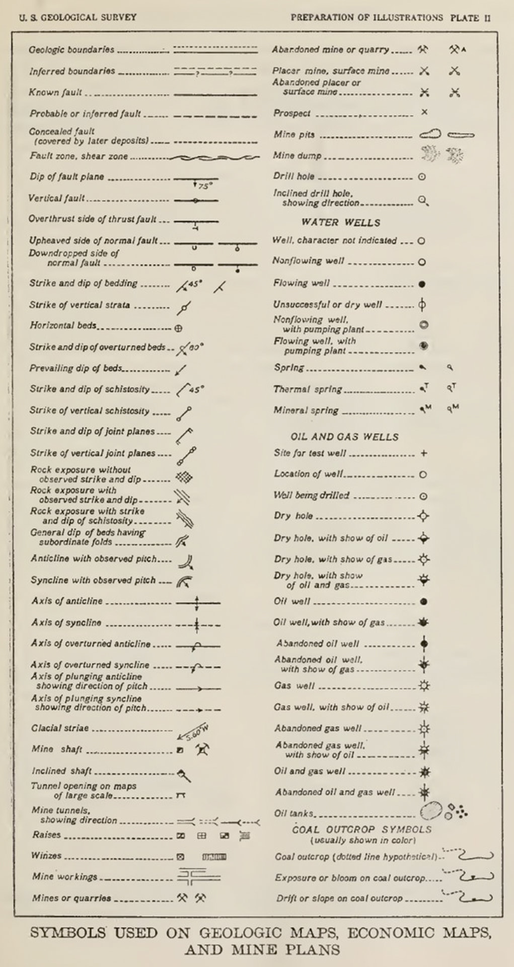
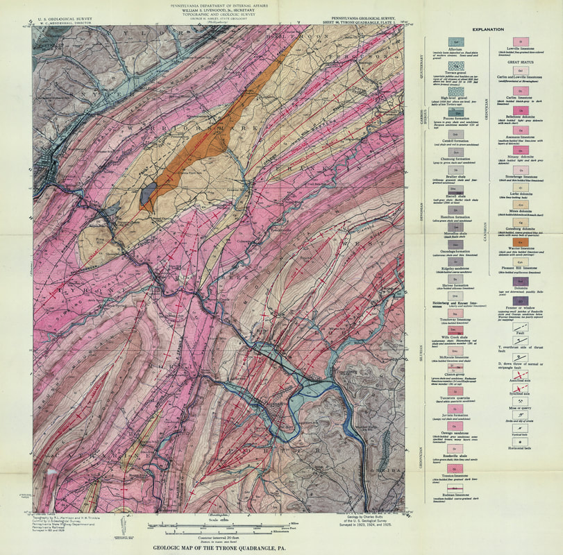
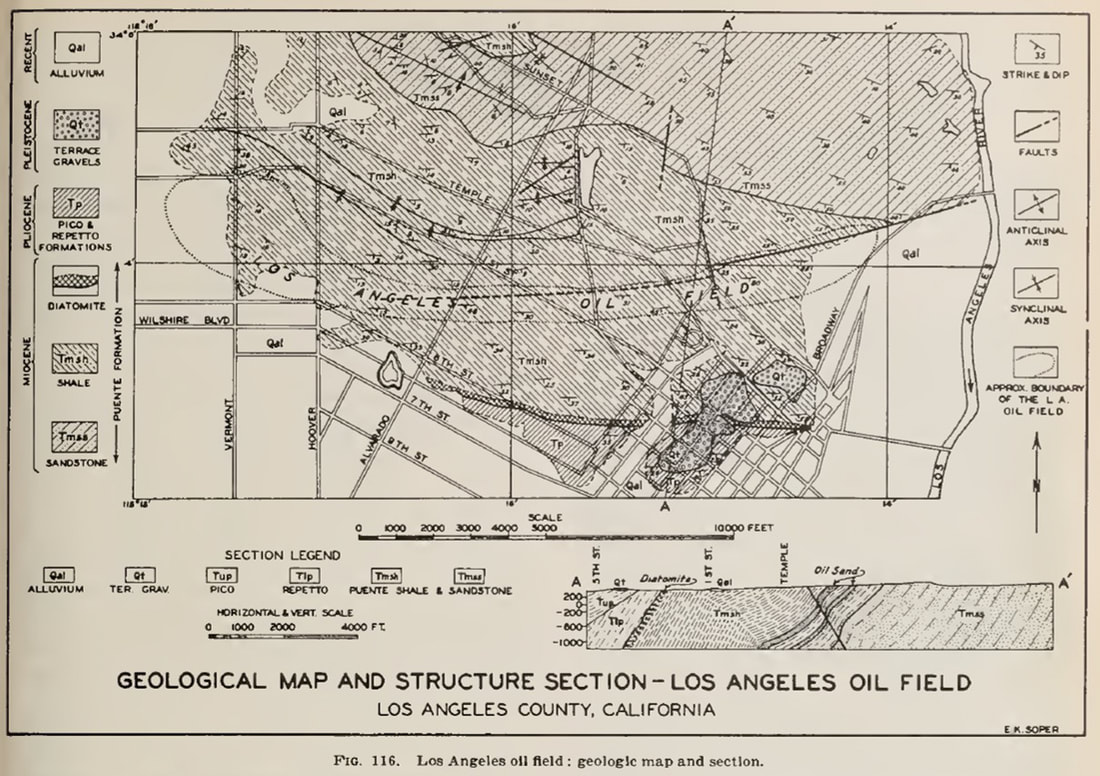
Mapping the Earth’s structural frameworkPaul Markwick As geologists, we all ‘know’ what a structural map is – the map representation of the geometry and kinematics of folds and faults. Nothing could be simpler. So, when John Jacques and I established the Petroleum Systems Evaluation Group (PSEG) at Getech back in 2004, building the structural framework for each of our new regional studies seemed the least of our worries. But, to our surprise, we were wrong. It turned out that not every structural geologist sees structural mapping in the same way. And as for the geophysicist view of structures… well, that is a story for another day. This was to cost us much time and monies. The question is, why? Faults and folds are amongst the clearest expressions of past tectonics that we can observe directly. The graphical representation of these features depends on application and scale. On geological maps, structural elements are usually shown by lines. These mark the trace of the intersection of each structural feature with the Earth’s surface. Kinematics are represented graphically by a commonly applied symbology (Figure 1). In many structural maps, sub-surface features are also represented by extending their top trace vertically until it intersects the current land surface (in our databases, we use an attribute to distinguish between features exposed at the surface and those in the sub-surface). This combination of line features is what John and I had in mind, given our focus on New Ventures exploration and how we would use the framework: to define the crustal architecture, build tectonic models and then develop paleogeographies. When we get to prospect scale (Figure 2), it becomes essential to consider the 3D geometry to calculate volumetrics, investigate fault closure, trapping mechanisms, migration pathways, etc. To this end, we build structural contour maps and show our faults at the surface as polygons representing the dip and throw of each fault plane with depth. Figure 1. An example of the data in our Structural Elements database for the area around Rukwa and northern Malawi. Features are represented by lines that mark the trace of faults at the surface (or projected up from their highest expression for subsurface faults) and axes of folds. When I think of a structural map in New Ventures exploration or most of my academic work, this is what I think of. Figure 2. An example of a prospect-scale map, in this case, a vintage map of the Inglewood oil field in California. The structural map (left) includes structural contours and faults as polygons to show the geometry of dip and throw (Jenkins, 1943) This difference due to application and scale is nothing new. It was also not the cause of the problems that John and I faced. I have been thinking about this recently. Primarily because I am once again building a global crustal architecture geospatial database, this time armed with 30 years of experience, much older and hopefully a little wiser. But also, because I am writing a new paper on the history of geological representation. Much has changed since 2004. For example, our understanding of the complexity of crustal architecture has developed substantially in the last decade due to the increased availability of ultra-deep, 2D seismic data along many of the world’s continental margins (Manatschal, Sutra and Péron-Pinvidic, 2010; Péron-Pinvidic and Manatschal, 2009). Databases and map representations need to take account of these advances. The new databases I am working on are more systematic, more integrated, more detailed, and based on more data. The workflow begins with the Structural Elements database, forming the framework around which all the other elements are built. Hence the reference to a structural ‘framework’. So, getting this database right, or as correct as possible, is critical because everything else hangs from this. Everything from the crustal facies and geodynamics databases to how we define our sedimentary basins and their depositional fill, and ultimately to plate reconstructions, paleogeography, and paleolandscapes. In revisiting this whole process and detailing the mapping workflow, I realized that some questions need to be explicitly addressed from the outset if we are to get others, not least our staff, to know what we want. These questions include the following:
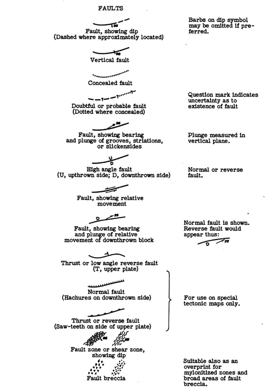
The answers to these are relatively straightforward once stated (answers at the end of the article) – operationally, these are now addressed in the extensive documentation created for each database. In this blog, I want to look at the history of structural mapping as a way to try and explain the problems that John and I encountered. Because by looking at this history, we can hopefully get closer to answering the fundamental question: What is a structural map? The ‘architecture’ of the Earth When Thomas Sterry Hunt first described the process of making his paleogeographic maps in his 1873 paper (Hunt, 1873), he stressed the importance of first understanding the underlying “architecture [of the Earth]” “The structure and arrangement of the materials of the earth’s crust, its architecture, as it were…” In this, Hunt was likely influenced by his experience as an exploration geologist and how structure often dictated the distribution of oil – Hunt was one of the first to recognize the link between anticlinal structures and oil fields (Hunt, 1862). Crustal ‘architecture’ is much more than mapping the structural ‘framework’ as a structural elements database. It encompasses all the crust. In reading back through the early 19th century literature, it is clear that when geologists referred to ‘structure’, they were using it in the same way as Hunt used [crustal] “architecture”. Indeed mapping faults and fold axes as lines developed relatively late in geology. Folding and faulting showed how dynamic the Earth was. You only have to read Humboldt, Hutton, or Lyell to get a sense of this. But when these geologists came to map this deformation, the resulting ‘structure’ was defined by outcrop geometry in map view or bed orientation in sections, rather than by discrete fault lines and planes. The maps of Smith, for example, show outcrop geometries that define folds and faulted boundaries but do not show the fold axes or faults themselves. Similarly, his cross-sections. So in this 19th-century view of a ‘structural map,’ we are not just representing the trace of fold axes or faults but the entire 3-dimensional crustal form. In terms of the databases I am building today, this would require three separate but related databases: (1) structural elements, which define the three-dimensional geometry of the rock volume, including folds and faults as a framework of line traces; (2) 'crustal' facies describing the geometry and composition/rheology of the lithosphere; and (3) bedrock geology, comprising the surface outcrop. We might add (4) igneous features; and (5) geodynamics, representing the dominant thermo-mechanical processes acting on the lithosphere. Both of these give additional information on the dynamic processes that generate the form. De La Beche and faults as lines It was Henry De La Beche who explicitly showed faults as lines in his sections (De la Beche, 1830). These thick black lines in sections (Fig.3) were replaced in map view by thick white lines. This symbology continued to be used on British maps throughout the 19th century (Fig. 4). There was no differentiation between different types of faults. But a search of 19th century maps suggests that the inclusion of fault traces was not universal. Even Élisee Reclus in his seminal work on global geography, did not show maps of major fault lines, although he did provide maps of the East African rift, showing the topographic fault scarps (“Line of Volcanic Fault” (Fig.104 in Reclus, 1876). Figure 3. Examples of faults shown in De la Beche cross-sections from various locations in the United Kingdom (De la Beche, 1830) Figure 4. An example of mapped faults represented by white lines on this map of the Mendips by De la Beche (1845). British Geological Survey materials © UKRI (1845) http://www.largeimages.bgs.ac.uk/iip/mapsportal.html?id=1000027 John Wesley Powell and the Standardization of Geological Maps The most significant change in structural mapping occurred in the 1880s, when John Wesley Powell, the second director of the newly formed USGS, started a drive to standardize map symbology and colors. In these maps, Powell explicitly showed structural elements (Powell, 1882), but like De la Beche, these were heavy black lines without associated markers. Powell also used dashed lines to show fault extents where the trace could not be discerned but was assumed to continue. Forty years earlier, De la Beche had also shown dashed fault lines on some of his maps, but had not explained what these meant in the legend; one assumes to show uncertainty like Powell: “Fault lines (particularly when they are formation boundaries) shall be indicated when actually traced by somewhat heavy full lines in black; and when not actually traced, by similar broken lines, toward which the formation devices may blend or fade as circumstances seem to require.” (Powell, 1890) This standardized approach to mapping was implemented under the auspices of the next USGS Director, Charles Doolittle Walcott. The results can be seen in the USGS “Folios of the Geologic Atlas of the United States”, a series published between 1894 and 1945, which included maps of topography and geology with an emphasis on structure and economic geology (see Figure 5 for an example from the Little Belt Mountains in Montana; Weed, 1899). Some of these folios also included structural contours on the maps (see Figure 6 from Clapp, 1907). Figure 5. An example map from the Folios of the Geological Atlas of the United States. In this example from 1899, faults are represented by solid and dashed black lines following the guidelines laid down by Powell in the 1880s. The inclusion of sections on the map is unusual but emphasizes an increasing focus on geological maps for resource exploration. Note that the map title now includes the term “Structure”. Figure 6. In this map from the “Folios of the Geological Atlas of the United States” series, the geologists have included structural contours in addition to stratigraphy, lithology, and structure (Clapp, 1907) The folios of Walcott during at the turn of the 19th-20th centuries look remarkable modern. But this ‘standard’ symbology does not seem to have been systematically adopted more widely outside of the U.S.. The British Geological Survey continued to mostly use white lines to represent faults until around 1912, after which they were changed to darker colors such as dark browns (Fowler et al., 1926) or dark blue lines (Ussher and De la Beche, 1953) (Figure 7). Although Strahan’s geological map of Ingleborough in 1910 (Strahan, 1910) users black lines and is more similar to Powell's scheme and the USGS folios. Figure 7. White solid lines continued to be used by the British Geological Survey until at least 1912 (left)(Ussher and De la Beche, 1912). Subsequent editions such as this reprint from 1953 (Ussher and De la Beche, 1953) show faults in dark blue (right image). This was not universal with Strahan’s map of Ingleborough in 1910 representing faults with black solid lines (Strahan, 1910). British Geological Survey materials © UKRI (1912) British Geological Survey (BGS) | large image viewer | IIPMooViewer 2.0 and (1953) British Geological Survey (BGS) | large image viewer | IIPMooViewer 2.0 (this is actually the 1962 reprint of the 1953 map) The nomenclature of Powell was expanded in 1920, when the USGS published formal guidance to its geologists on how to prepare illustrations and maps (Ridgway, 1920). Faults on maps were now represented by lines with associated marker symbols to indicate the footwall and hanging wall sides of normal faults, and overthrust (upper plate) side of thrusts. Anticlines and synclines were represented by a line along the fold axis, differentiated by arrows perpendicular to the line - a symbology that has changed little since (Figure 8). Figure 8. The map symbol set presented by the USGS in 1920 (Ridgway, 1920) This map nomenclature was quickly adopted and most clearly exemplified in the detailed local USGS maps of the time, for example, the excellent 1929 geological map of the Tyrone quadrangle in Pennsylvania (Figure 9) in which thrust faults, normal faults, synclines, and anticlines were differentiated (Butts, 1929). In Britain, the 1:63,360 map of Norham used a tick mark to denote the downthrown side of faults (Fowler et al., 1926). But we can also see its use in exploration maps during the following decades (Figure 10). And it was the oil Industry that then started to drive the need for more significant differentiation in the structural elements symbol set. Figure 9. The 1929 geological map of the Tyrone quadrangle in Pennsylvania (Butts, 1929). Note the use of different symbols for anticlines, synclines, normal and thrust faults. Many of the fold axes are named. Image made available online courtesy of the Pennsylvania State University. Figure 10. The Los Angeles City Oil field showing fold axes and faults in the 1940s (Jenkins, 1943) The need for more symbols It was becoming clear that there was a much greater diversity of structural models – different fold and fault types - that needed to be represented graphically (Boyer and Muehlberger, 1960; Crowell, 1959; Davis, 1913; Hill, 1947; Hubbert, 1927; Reid et al., 1913; Sopwith, 1875; Straley III, 1934). In 1950 the USGS expanded the range of recommended fold and fault symbols (Cloos et al., 1950), including many that we still use today. But it still lacked the diversity of symbols that we use today. It also restricted some symbols to specific types of maps (Figure 11). Figure 11. The additional fault symbols suggested by Cloos et al. (1950) for the USGS. It is interesting to note that although the saw-tooth marker symbol for thrust and reverse faults is illustrated, it is only "for use on special tectonic maps". From 1989 to 1995, the USGS built a more extensive cartographic standard map symbol (Reynolds, Queen and Taylor, 1995; Soller, 1996). In this version, all thrust faults were represented using the saw-tooth marker pattern, which is now the most widely used visualization. Normal faults were still represented by a tick mark to indicate the downthrown side. This was further expanded with the 2006 update to the USGS symbol set (Federal Geographic Data Committee, 2006). However, confusingly here, the USGS chose to represent normal faults with half-circles indicating the downthrown side and rectangles to represent the upthrown block of reverse faults. Unfortunately, by this time, other structural geologists and many companies had already appropriated the idea of using rectangle markers but to replace the tick marks on normal faults (Hulshof, 2012; Markwick, 2019); this included Robertson Research in the late 1990s, which is where I got into the habit. Other organizations, such as the BGS, continue to use tick marks (Mawer, 2002). With this diversity of map symbols, we can create a more detailed map of the ‘structural framework’ built of structural elements. These are the map representations of the structure rather than the whole structural form: a fold axis, not the entire fold form, a fault trace at the surface (or top sub-surface fault trace), not the whole fault plane. It is these elements that are recorded in our Structural Elements database. This distinction may seem like semantics. But it is important, and as we stressed at the beginning of this article, it is a function of the application. In New Ventures exploration or plate modeling or paleogeography, we need to understand the overall structural context and what it tells us about geodynamic evolution, whether for basins or basin hinterland. But at the prospect scale, we need to understand the form. This explains why we distinguish between the “structural framework” and the “crustal architecture” of which the framework is an integral part in our paleogeographic workflow. A further complication here is that when we talk about ‘crustal’ architecture, we are, of course, referring to the whole lithosphere - nothing is ever simple! We all know what a structural map is. Don't we? So, what was the cause of the problems that John and I had? In truth, even with 15 years of hindsight, I still do not fully understand the causes. But I think I have more of an idea than I did then. What is a structural map? When looking at the example in figure 1, everything seems obvious. John and I had assumed that all structural geologists saw a structural map, in the same way, especially the most experienced structural geologists, those with the most years. But what they ‘knew’ and we ‘knew’ turned out not to be the same. In our defense, I should point out that we ultimately hired a brilliant Polish structural geologist, whose tectonic model of SE Asia is, I still think, one of the best solutions I have seen for that area. And then a series of excellent MSc graduates who all immediately understood what we meant. So perhaps it was also partly the individuals concerned after all? Perhaps… Structural mapping is fundamental to solving geological problems, especially in resource exploration. Getting the structural framework right impacts everything else, which we then build upon it. As geologists, we all ‘know’ what a structural map is. But what we ‘know’ has changed through time, depends on the application, and, as it turns out, it may also depend on the geologist you ask. So what have I learned? Always explicitly define what you mean and assume nothing. Further Information If you would like to learn more about the Knowing Earth suite of structural and crustal architecture databases or any of our other Knowing Earth databases, please contact me at paul.markwick@knowing.earth. This blog is part of a longer paper on the history of structural mapping that will be presented later this year. The first version of the cartographic symbol set used by Knowing Earth was published as part of Markwick (2019) and is available through the Geological Magazine website https://www.cambridge.org/core/journals/geological-magazine/article/abs/palaeogeography-in-exploration/444CC2544340A699A01539A2D4C6E92A The associated ArcGIS style file can be downloaded from my research website: www.palaeogeography.net We will be publishing our new 2021 version shortly. Others symbol sets available on-line. USGS: https://ngmdb.usgs.gov/fgdc_gds/geolsymstd/download.php BGS: http://nora.nerc.ac.uk/id/eprint/3221/1/RR01001.pdf Shell: https://www.arcgis.com/home/item.html?id=8a89e7ffe4154efa94c65090c4dab485 Knowing Earth: http://www.palaeogeography.net/publications.html References cited Boyer, R. E. & Muehlberger, W. R. 1960. Seperation versus slip. AAPG Bulletin 44, 1938-39. Butts, C. 1929. Geologic map of the Tyrone quadrangle, Pa. Harrisburg, Pa.: Pennsylvania Bureau of Topographic and Geologic Survey. Clapp, F. G. 1907. 144. Amity folio, Pennsylvania. In Folios of the Geologic Atlas: USGS. Cloos, E., Pusey, L. B., Rubey, W. W. & Goddard, E. N. 1950. New list of map symbols: [for use in publications of the Geological Survey]. p. 6. Washington, D.C.: United States Geological Survey. Crowell, J. C. 1959. Problems of fault nomenclature. Bulletin of the American Association of Petroleum Geologists 43 (11), 2653-74. Davis, W. M. 1913. Nomenclature of surface forms on faulted structures. GSA Bulletin 24 (1), 187-216. De la Beche, H. T. 1830. Sections & views, illustrative of geological phaenomena. London: Treuttel & Würtz, 71 pp. De la Beche, H. T. 1845. 1:63,360 geological map series [Old Series] Sheet 19, [Bath, Frome, Axbridge, Wells, Glastonbury, Bruton, Mere, Somerset Coalfield, and southern part of Bristol Coalfield.] , Solid. Geological Survey of England and Wales. Federal Geographic Data Committee 2006. FGDC digital cartographic standard for geologic map symbolization. p. 290. Reston, VA.: Prepared for the Federal Geographic Data Committee by the U.S. Geological Survey. Fowler, A., Carruthers, R. G., Geikie, A. & Gunn, W. 1926. 1:63,360 geological map series [New Series] Sheet 1, Norham, Drift. Revised. Geological Survey of England and Wales. Hill, M. L. 1947. Classification of Faults. AAPG Bulletin 31 (9), 1669-73. Hubbert, M. K. 1927. A suggestion for the simplifcation of fault descriptions. The Journal of Geology 35 (3), 264–69. Hulshof, B. 2012. Shell Standard Legend. p. 38. Amsterdam: Shell Global Solutions International B.V. Hunt, T. S. 1862. Notes on the history of petroleum or rock oil. In Annual report of the board of regents of the Smithsonian Institution, showing the operations, expenditures, and condition of the institution for the year 1861 pp. 319-29. Washington, D.C.: Government Printing Office. Hunt, T. S. 1873. The paleogeography of the North-American continent. Journal of the American Geographical Society of New York 4, 416-31. Jenkins, O. P. 1943. Geologic formations and economic development of the oil and gas fields of California (In Four Parts, Including Outline Geologic Map Showing Oil and Gas Fields and Drilled Areas). In California Department of Natural Resources, Division of Mines, Bulletin p. 773. California Department of Natural Resources, Division of Mines. Manatschal, G., Sutra, E. & Péron-Pinvidic, G. 2010. The lesson from the Iberia-Newfoundland rifted margins: how applicable is it to other rifted margins? In Central & North Atlantic Conjugate Margins Conference Lisbon. Markwick, P. J. 2019. Palaeogeography in exploration. Geological Magazine (London) 156 (2), 366-407. Mawer, C. H. 2002. Cartographic standard geological symbol index, Version 3. p. 49. Keyworth, Nottingham: British Geological Survey. Péron-Pinvidic, G. & Manatschal, G. 2009. The final rifting evolution at deep magma-poor passive margins from Iberia-Newfoundland: a new point of view. International Journal of Earth Sciences (Geologische Rundsch) 98 (7), 1581-97. Powell, J. W. 1882. Second Annual report of the United States Geological Survey to the Secretary of the Interior, 1880-1881. In Annual Report p. 764. United States Geological Survey. Powell, J. W. 1890. Tenth Annual report of the United States Geological Survey to the Secretary of the Interior, Part 1: 1888-1889. In Annual Report p. 774. United States Geological Survey. Reclus, É. 1876. The universal geography : the earth and its inhabitants. vol. XIII. South and East Africa. London: J.S. Virtue & Co., Limited, pp. Reid, H. F., Davis, W. M., Lawson, A. C. & Ransome, F. L. 1913. Report of the committee on the nomenclature of faults. GSA Bulletin 24 (1), 163-86. Reynolds, M. W., Queen, J. E. & Taylor, R. B. 1995. Cartographic and digital standard for geologic map information. In USGS Open-File Report p. 257. USGS. Ridgway, J. L. 1920. The preparation of illustrations for reports of the United States Geological survey : with brief descriptions of processes of reproduction. p. 101. Washington, D.C.: United States Geological Survey. Soller, D. R. 1996. Review of USGS Open-file Report 95-525 ("Cartographic and digital standard for geologic map information") and plans for development of Federal draft standards for geologic map information. In USGS Open-File Report p. 12. U.S. Geological Survey. Sopwith, T. 1875. Description of a Series of Elementary Geological Models Illustrating the Nature of Stratification ... with Notes on the Construction of Large Geological Models. R.J. Mitchell & Sons, 82 pp. Strahan, A. 1910. Guide to the Geological Model of Ingleborough and District. pp. Straley III, H. W. 1934. Some notes on the nomenclature of faults. The Journal of Geology 42 (7), 756-63. Ussher, W. A. E. & De la Beche, H. T. 1912. 1:63,360 geological map series [New Series] Sheet 350, Torquay, Drift. With additions. Geological Survey of England and Wales. Ussher, W. A. E. & De la Beche, H. T. 1953. 1:63,360 geological map series [New Series] Sheet 350, Torquay, Drift. With additions. Reprint. Geological Survey of England and Wales. Weed, W. H. 1899. 56. Little Belt Mountains folio, Montana. In Folios of the Geologic Atlas: USGS. Answers to the questions Q1. Should the maps be based on published maps (secondary data) or interpreted from primary data? Answer. The intention is that all structural features in the database should be identified in primary data. This data includes gravity and magnetic data, seismic, radar, bathymetry, topography, Landsat, and observations. Features from secondary (published) data are only included if the feature is considered important but cannot be seen with primary data available (remember that the primary data are all publicly available). In these cases, the feature will carry by default a low mapping confidence and will have attribution reflecting its source. We have kept such ‘secondary’ interpretations to a minimum (<<1% of the entire database). Q2. Should we assume that existing interpretations are correct? Answer. Assume nothing. Generally, the location of a feature would have been placed using primary data and information from published, secondary sources will refer to the age assignments or kinematic histories. Attribution is used in the database to explain the source of this information – i.e., what it is based on if quoted in a paper. Q3. What density of structures should be mapped? Answer. This will depend on the data grain and structural complexity. Map what you can see, but consider a set resolution limit and keep to that. This becomes the “minimum resolvable feature” in the database. In operation, there is a clear density difference between features mapped on land using Landsat or SRTM3 radar data and features in the oceans constrained only by satellite-derived gravity anomalies. Q4. Should only features with a direct link to petroleum be recorded? Answer. No. This database is about understanding the Earth so not restricted to any single application. Q5. Should the maps only show the present-day geometry of features or show the past geometry at a time of the compilers' choosing/interest? Answer. The default database is the present-day geometry. Separate databases are used for each geological timeslice starting with features extracted from the present-day database and rotated. Changes in kinematics are stored in a related “Activation” table. Also, be aware that there will be cases where features will need to be spatially adjusted after rotation to reflect deformation (palinspastic reconstruction), especially in compressional settings. In the oceans, there may also be features that no longer exist (subducted). Q6. Should the maps be schematic with segments linked into a continuous form (general pattern of faults and folds) or only what is ‘observed’ (actual or as close to reality as possible)? Answer. Observed takes precedence, but connections may sometimes be useful. If so, connections will have the lowest confidence and be dashed. This is why attribution is so crucial. A pdf version of this blog is available for download here
1 Comment
|
AuthorDr Paul Markwick Archives
November 2023
Categories |
|
Copyright © 2017-2024 Knowing Earth Limited
|
E-mail: contact@knowing.earth
|

