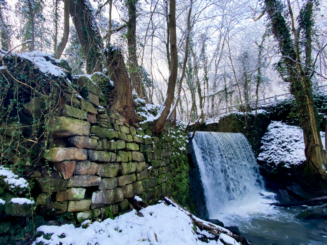
Welcome to the Energy Transition. Again!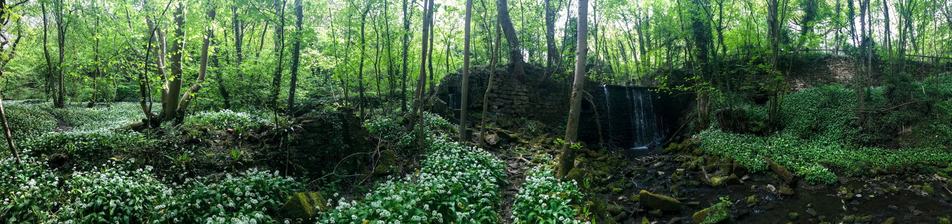 Sitting amongst the ruins of Derrydiddle Mill here in West Yorkshire, surrounded in the spring by wild garlic and bluebells, it is hard to imagine the hive of activity this would have been 200 years ago. The clatter of the carding and spinning machines, the water wheels turning, the carts coming back and forth over the narrow bridge to the Bradford Road. Today, we talk about 'the' energy transition as if this is the first time. But our relationship with energy has changed before. Here at Derrydiddle Mill, we have part of the record of one of those earlier energy transitions. In this case, from the power of running water to that of steam. This was a transition from mediaeval technology to that of the Industrial Revolution. What lessons can this history give us about how transitions happen and what to expect as we pursue our own 21st-century energy transition? Derrydiddle Mill: from Water to Steam. A 19th-century Energy Transition When, in 1815, Joshua Dawson and William Ackroyd travelled the short distance across the Chevin Hill from Guiseley to the Wharfe Valley, they established their first worsted wool mill here on Gill Beck (Ellar Ghyll), as it cuts down through a narrow gorge in the Millstone Grit on its way to join the River Wharfe at Otley. This site was a logical location with flowing water to drive the water wheels that would power the mills. But within a few years of establishing Derrydiddle Mill, Dawson and Ackroyd had moved the main centre of their operations to a location on the banks of the River Wharfe in Otley at what is now called Otley Mills. When I first read of this sudden move, I assumed this would provide an example of the energy transition from water to steam and proof of how quickly such changes can happen. But the story is a little more complex because this new site was also powered by water. Indeed, it was not until the 1840s that Ackroyd installed a steam-driven beam engine at Otley Mills. Only then, from the mid-1840s to 1850s, do we see the rapid adoption of steam power across the north of England and the development of the large mills that still dominate many cities and towns today. So, why the sudden move to Otley? Why did the transition to steam not happen immediately? Is this really a guide to how energy transition works? Can history tell us anything? Energy Transition can happen quickly, but not always when and why you might expect!
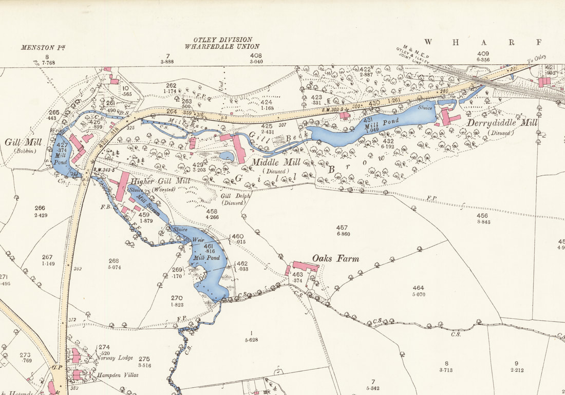
Derrydiddle Mill was the lowest of a series of mills distributed for a kilometre or so (0.6 miles) upstream of Derrydiddle; each assigned a different part of the worsted wool workflow. The power of moving water had been fundamental to industry, especially the wool industry in England, since the early Mediaeval period, some 600 years before Derrydiddle Mill was founded. Much of that early development had been by monastic orders, such as the Cistercians of Fountains Abbey, some 20 miles (c.32 km) to the north of us here, who had developed a business model and processes for wool production that might be considered a mediaeval mini-industrial Revolution. It was, therefore, not a surprise that Dawson and Ackroyd would start with this proven technology. But after moving to Otley Mills, Ackroyd and Dawson continued to use flowing water as their power source. This despite the fact that steam power had been around for 100 years before Dawson and Ackroyd moved their business to Otley. It was not until the 1840s that Ackroyd built his first steam-driven engine house (Richardson and Dennison 2020). So why move from Derrydiddle Mill? And why not which to steam straight away? Well, in part because this was a mixture of cost and technology. The Boulton and Watt designs, which Watt had patented, dominated steam beam engines throughout the late 18th and early 19th centuries. It was not until William McNaught's compound beam engine in 1845, and especially the development of the Corliss engine in 1849 with its rotary valves, that the market really changed. But also, there was no competitive need in those early days because most other mills were still running on water [sic]. The move from Derrydiddle Mill to Otley Mills appears to have been driven by two immediate considerations unrelated to energy transition: (1) Gill Beck did not provide the space for expansion, and (2) opportunity, the site was available, and a water management system was already in place. The space for expansion would become important in the following decades, not least because it allowed Ackroyd to bring all the worsted processes together into one integrated mill complex. The Otley Mills site had been the location of an old cotton mill dating back to the middle of the 18th century when the course of the river Wharfe had been modified to provide power. So here was a ready-made site that could, and was, adapted to worsted wool.
But the world was changing, not just in terms of improving steam engine technology but also in terms of the business environment. It would be the combination of both of these developments that would ultimately drive the energy transition. 1815, the year Ackroyd and Duncan built their first mills on Gill Beck, was also the year of the Battle of Waterloo. The great upheavals that had stalked European politics since the French Revolution were starting to settle down, and with relative stability came an acceleration in Industrialization as international trade expanded. This period also saw the increasing availability of bank loans, the development of the canal transport network, which by 1840 was starting to be replaced by trains, expanding international trade routes, increasing urbanisation as workers abandoned rural life for the industrial towns and cities, and a growing middle class with an appetite for buying things, including more woollen suits. All these changes were soon to have an impact on that mediaeval technology of flowing water. When Ackroyd did switch to steam in the mid-1840s the effect on his business was immediate with a major expansion of the mill complex at Otley Mills. It also marked the growth of Ackroyd's fortunes as he became a significant player in local politics. But he was not alone. During the late 1840s-1850s, we see the consolidation of the numerous small mills in small towns into enormous single factories with their related communities. The largest of which was the famous Salts Mill (1853) at Saltaire (https://saltsmill.org.uk/), which at that time it was built was the largest industrial building, by floor area, in the world. Now, competition was driving businesses to transition to steam. In the middle of the 19th century, the bottom line was that if you didn't move to steam, you would lose out to those who had. So, the 19th century energy transition here in Otley was not just about technology or a desire to change. It was about the broader context of political, economic and societal changes, and then when the transition happened, the pressure of competition that was being driven by consumers. In our own time, we can think about the 'rapid' adoption of electric vehicles (EVs) over the last decade but how this varies by country. Tesla made owning EVs desirable. But they are expensive, so you need people with cash. You also need battery technology to the point where you can drive an EV as if it were a combustion engine. Finally, you also need a government willing to invest in infrastructure. So, the energy transition at the beginning of the 19th century was relatively rapid (decades) but not instantaneous. It was about technological advances, but also contemporary political, economic, and societal changes. It was also about the market – competition and demand. Transitions transition It is unclear how long Derrydiddle and its associated mills on Gill Beck remained active. The buildings and mill pond at Derrydiddle are labelled as "disused" on the 25-inch to 1-mile map of 1893. However, Gill Mill and Higher Gill Mill are not. This suggests that at least some of these mills remained operational until the end of the century. Intriguingly, 1893 is the first time it was named on a map as "Derrydiddle Mill". Part of the reason for this was probably to maximise Ackroyd's original investment in Gill Beck. But it was also because these older technologies still worked, just not as efficiently. So water-power and steam-power, mediaeval and industrial technologies, ran in tandem for at least 50 years in the Wharfe Valley. Adopting new technologies can be rapid, but this does not mean that older energy sources and technologies are instantly abandoned. Transition is about transition.
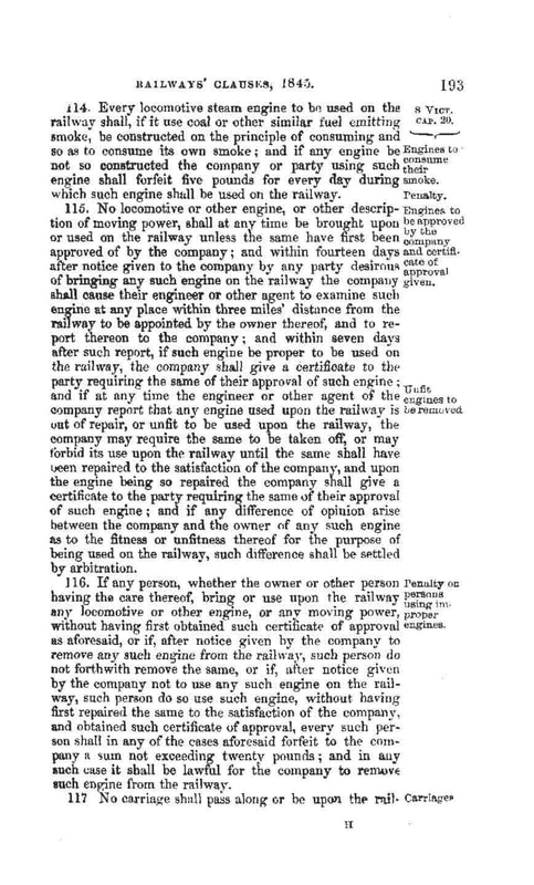
Change may not go in the direction you expect - the unfortunate case of unforeseen consequences The consequences of steam power were many and varied. Energy was no longer dependent on local sources, especially the power of flowing water, which had long kept businesses small and stuck in the hills. Although, it is no coincidence that much of the British Industrial Revolution was associated with the location of coal and iron fields. For the mill owners, steam provided a sudden increase in productivity, a move away from a dependence on manual labour, and a way to make bundles of cash! But perhaps the most significant change was the ability to move goods and people at speeds and 'ease' that had never been experienced in human history. For many, the steam train epitomises the Industrial Revolution and the modern age. The early experiments such as Stephenson's Rocket (1829) or the "Lion" built by Todd, Kitson, and Laird here in Leeds in 1837. These are just two of the many steam locomotives etched in our history that began a British love affair with steam trains. I must admit I like steam trains. Steam trains also had an unexpected societal benefit as the network expanded and people realised how much they liked or had to travel, the benefit being that in moving and mixing populations, the bane of inbreeding began to recede. But these early steam trains must also have been terrifying for a population that had grown up in the countryside, where nothing moved particularly fast. And not just the 'high' speeds and noise, but all that smoke. To address this concern, the Railway Clauses Consolidation Act of 1845 stipulated that all engines had to 'consume their own smoke' (HMG Railway Clauses Consolidation Act 1845):
Sadly, by 1845, industrialisation and societal changes were happening so quickly that this law was quickly abandoned or, at the very least, conveniently ignored. The reasons will be familiar to us: the train system was rapidly expanding, and coal had replaced coke as the primary energy source due to the sheer cost of producing coke and the increased demand for energy. In short, consumer demand trumped environmental sense and good intentions. For our current energy transition, it is clear that we will need more critical minerals such as cobalt and lithium. But as demand grows as we transition, what impact will that have on the countries that produce them and the politics of exploring for them? How much of our land are we willing to see turned over to solar farms? And what about nuclear? An excellent overview of the complexity of the problem can be viewed in Ed Conway's Sky News report on Chile and the consequences of the demand for critical minerals, https://news.sky.com/video/battle-for-chiles-critical-minerals-12643766). This is a salutary lesson from the Past. No matter how good your intentions are or how serious your (environmental) concerns are, the fear of individuals that they do not have enough money to buy food, heat their homes or care for their kids will trump everything else. This is exactly what we are seeing today (2023) in the UK, with a cost of living 'crisis', energy 'crisis' and climate' crisis'. So many crises, and no guesses for which of the crises people are now focussed on! Just as in 1845, this is not a statement of which of these crises is the most important for the long term, but the sobering reality of realpolitik. History is clear: change begets change, and sometimes, despite our best intentions, it may take us in directions that have negative consequences. There are always consequences. And those consequences can hit us very quickly. Driven by demand - the problem of increased consumption That problem of unforeseen consequences was largely driven by the growth in demand - the understandable desire to have a better life than your parents and to have all the new goodies that go with that way of life. Industrialisation initially improved the life of the average country worker, but as the population increased and more people moved to the cities, and more mill owners sought to make more monies, things got out of hand. When the population of Great Britain was 10.5 million at the turn of the 18th-19th century, switching to burning fossil fuels for energy was not such a problem. But during the 19th century, we see an increase in per capita energy consumption (1800: 37.750 kcal/day; 1900, 100,100 kcal.day; 2000, 135,800 kcal/day; Warde 2007), an increase in population (by 1900, the population of Great Britain was c.30.5m), and so a total increase in energy consumption. The fastest levels of consumption growth were between the mid-1830s and mid-1870s, so it is no surprise that this coincided with high pollution, degradation, poverty, and disease. The "great stink" of 1858 in London was just one expression of this trend. Although many of these problems were ultimately overcome, for much of the 19th century, a life that had started to look so much better suddenly became rather unpleasant. When considering energy transition, do not forget what drives our insatiable demand for energy. Renewables require battery technologies, and these are resource-limited. Consumption is the elephant in the room. And it is a very big elephant! A pre-industrial life does not necessarily mean a good life One final thought on Derrydiddle Mill. There is often a rose-tinted view of the world before Industrialisation. We can see this in the words of many environmental groups today. But such a view is far from new. The Romantic movement of the late 18th and early 19th century harked back to an idyllic lifestyle that never actually existed unless you were independently wealthy, as most of the romantic poets were (or they knew someone who was!). Life before the Industrial Revolution was not good. Life expectancy for the majority was short (less than 32.4 years for Londoners prior to the 1810s when Derrydiddle was built; Mooney 2002), and freedoms were limited. Working at Derrydiddle Mill, though based on water power, may not have been pleasant and was certainly not idyllic. But it was a paid job! We also need to remember that before the Industrial Revolution and the rapid adoption of fossil fuels as the primary power source, it was not as though only water or wind were used. Coal and peat have a long history of usage, going back to the Romans. Indeed, for much of human history, the dominant source of energy was burning wood. The Past is not necessarily an idyll. But we can learn from it and extract the best points. |

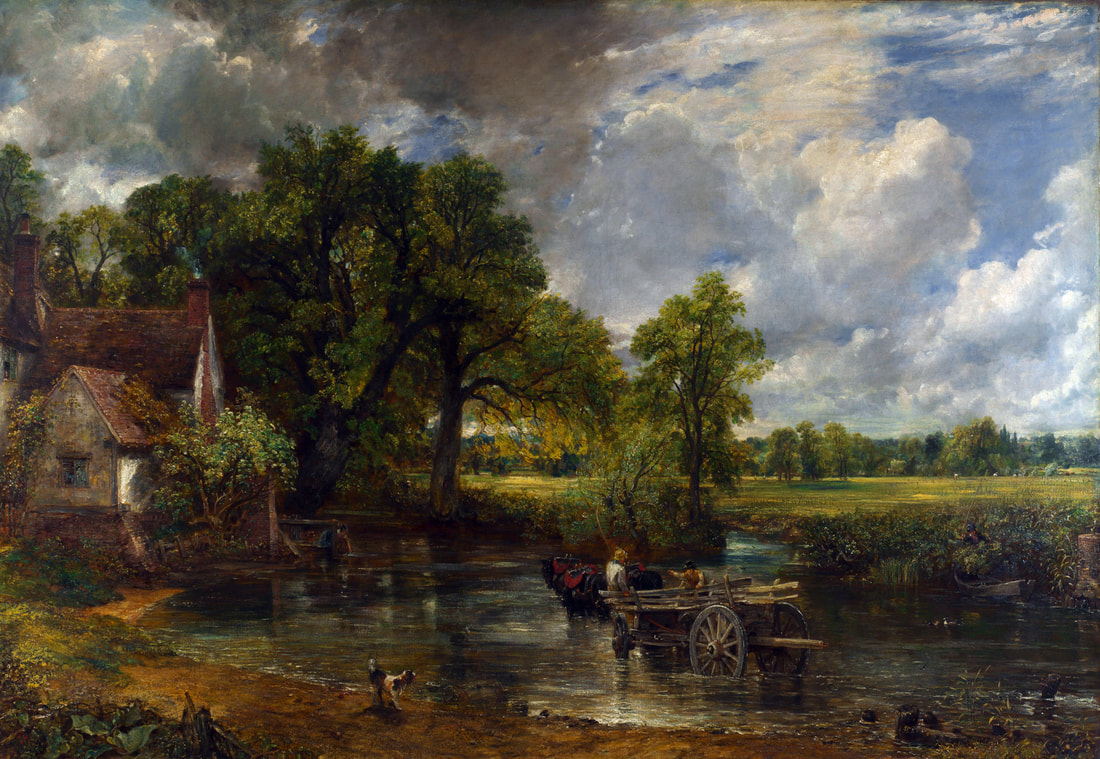
| The Hay Wain by John Constable (1821). The romantic view of a pre-industrial rural world. Image from https://commons.wikimedia.org/wiki/File:John_Constable_-_The_Hay_Wain_%281821%29.jpg |
Final thoughts: What clues can the past give us?
Today, we have the benefit of advanced technologies, science and an ability to quickly and easily look at history through digitised records, from which we can draw on lessons and learnings. If we so wish.
What can we learn from that early 19th-century energy transition?
What can we learn from that early 19th-century energy transition?
|
Of course, this is not a simple comparison.
Whilst the lessons from the 19th century may provide a guide to how change happens, there is a fundamental difference between then and now.
Today, the main driver for change is political and societal pressure for an energy transition to low or non-carbon sources in response to concerns over climate change. This driver was not something that the early 19th-century business community faced, William Wordsworth notwithstanding (the subject of a future blog).
We will have to leave it to future historians to record whether such pressures are enough to drive the energy transition or whether, in the end, it is money and the market that ultimately dictate how and when change happens.
The ruins of Derrydiddle Mill today make for a very pleasant afternoon walk. They remind us of a past energy transition that shaped the modern world. How that energy transition happened may provide clues about dealing with similar challenges today, or at least the pitfalls and drivers to watch out for.
But one thing is clear: there is no going back.
About the Author
 | Paul Markwick is CEO of Knowing Earth, a scientific consultancy based in northern England. He has spent a career investigating the Earth system and applying this understanding to natural resource exploration. Paul's expertise includes global and regional tectonics, palaeogeography, palaeoclimatology and palaeoecology, on which he has published extensively. Paul has a BA from Oxford and a PhD from The University of Chicago. Contact details: paul.markwick@knowing.earth |
The full version of this blog is available as a pdf here
0 Comments
A Guide to Taking Geological Field Photos. 2. What Kit do I Need?
Paul Markwick
Fieldwork is an integral part of science and especially the Earth sciences. Indeed, for many of us, getting out into the 'field' is the main reason why we became geologists in the first place. Central to fieldwork is making and recording primary observations. For this photography is a key tool. Back in 2020, I wrote a blog with ten tips for field photography. This formed the basis for two online workshops during the UK's second lockdown in 2021. Two questions kept coming up, (1) what photographic field kit did I use? and (2) is a phone camera good enough for field photography? In this blog I provide some answers to both these questions by describing my fieldwork experience and some of the field photography equipment I use. Hopefully, you will find this of use.
Photographic equipment can be quite personal, and I am sure many of you will have your own preferences. It is also a question of budget.
Of course, for many of you for whom photography is a hobby and not just a tool, you will want to have equipment that enables you to take great photographs as well as recording what you see.
The best starting place for considering field gear is to ask a very simple question: "Why do we need a camera for fieldwork?"
The answer to that question takes us back to why we do fieldwork at all. The answer is to make and record primary observations in the real world. So the objective of fieldwork photography is to capture information so that you can communicate your observations.
1. Cameras or Smart Phones?
Digital technology has changed photography enormously over the last 20 years. For fieldwork, these changes have definitely been for the better. No longer are we limited by the number of pictures we can take (24 or 36 per roll multiplied by how many rolls of film we can afford or fit in our day bags), nor do we have to wait a week or more to see the results.
Which camera you use is as much about your budget and experience as anything else.
In choosing your camera, the best advice is to list the key features you need, such as sensor resolution, size, and price. Then, check this list against what is on offer. There is a considerable amount of help now available online. YouTube has a range, but I can recommend Ken Rockwell's excellent review site, https://kenrockwell.com/index.htm, or Digital Photography Review, https://www.dpreview.com/. I have used both in the past, especially Ken's website.
Once you have a shortlist, there is nothing better than going into a store, getting the 'feel' of the cameras on your list, and making a decision from this. You can then also get the advice of the experts in the store.
If the price is an issue, why not check second-hand deals from reputed camera stores?
My go-to DSLR is a Nikon D810 (https://www.dpreview.com/products/nikon/slrs/nikon_d810/specifications), which I have now had since about 2015. This is a great camera, but relatively large and heavy.
My decision here was based on several criteria:
(1) I needed a high-resolution sensor because I was using the photos for professional applications, and I already knew that I would need to zoom into a photo and crop it to get the images I wanted;
(2) a camera that was robust and weatherproofed (essential given where I take it);
(3) one that would give me the flexibility to either allow the camera to make all the decisions or to allow me to have complete manual control;
(4) that the camera was compatible with my existing camera gear.
Another plus of this camera is its ability to capture HD video.
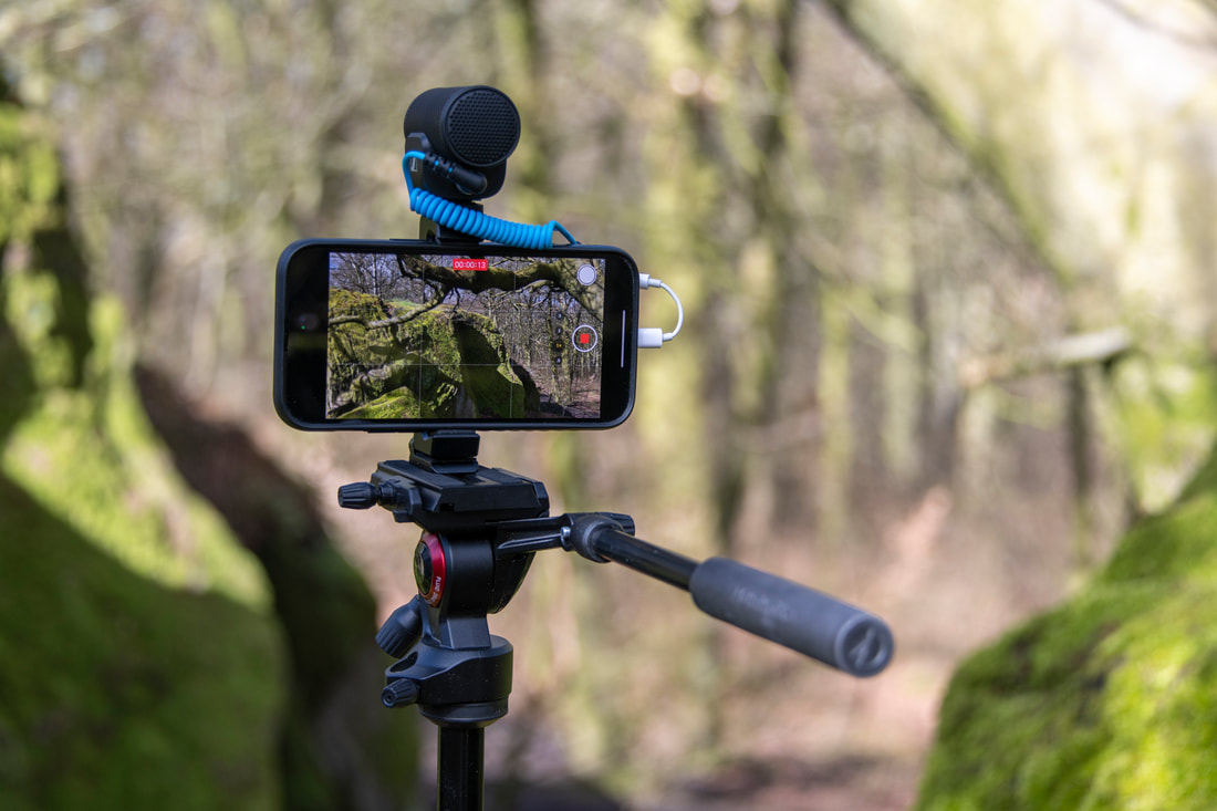
But the last time I was in the field, which was May 2022 and my first trip abroad after the COVID pandemic, I left my trusted D810 at home and relied on my iPhone 11 Pro. This was something of an experiment.
Most of us still take large digital SLR cameras into the field. But the cameras on phones are now so good that, in most circumstances, these will meet your needs and certainly be ideal for capturing your field sketches. The panorama mode on the iPhone is especially useful for capturing big-picture landscapes.
Most digital cameras will record the location of each photo, especially if you are using a smartphone. But it is always worth noting the photos you have taken on your sketch – "panorama photograph," "detailed of this part of the outcrop," etc.
Please remember to save your photos to the cloud or your computer. I use Dropbox and iCloud as additional backup insurance.
Are Apple iPhones and other smartphones 'good enough'? Absolutely!
Which camera you use is as much about your budget and experience as anything else.
In choosing your camera, the best advice is to list the key features you need, such as sensor resolution, size, and price. Then, check this list against what is on offer. There is a considerable amount of help now available online. YouTube has a range, but I can recommend Ken Rockwell's excellent review site, https://kenrockwell.com/index.htm, or Digital Photography Review, https://www.dpreview.com/. I have used both in the past, especially Ken's website.
Once you have a shortlist, there is nothing better than going into a store, getting the 'feel' of the cameras on your list, and making a decision from this. You can then also get the advice of the experts in the store.
If the price is an issue, why not check second-hand deals from reputed camera stores?
My go-to DSLR is a Nikon D810 (https://www.dpreview.com/products/nikon/slrs/nikon_d810/specifications), which I have now had since about 2015. This is a great camera, but relatively large and heavy.
My decision here was based on several criteria:
(1) I needed a high-resolution sensor because I was using the photos for professional applications, and I already knew that I would need to zoom into a photo and crop it to get the images I wanted;
(2) a camera that was robust and weatherproofed (essential given where I take it);
(3) one that would give me the flexibility to either allow the camera to make all the decisions or to allow me to have complete manual control;
(4) that the camera was compatible with my existing camera gear.
Another plus of this camera is its ability to capture HD video.
But the last time I was in the field, which was May 2022 and my first trip abroad after the COVID pandemic, I left my trusted D810 at home and relied on my iPhone 11 Pro. This was something of an experiment.
Most of us still take large digital SLR cameras into the field. But the cameras on phones are now so good that, in most circumstances, these will meet your needs and certainly be ideal for capturing your field sketches. The panorama mode on the iPhone is especially useful for capturing big-picture landscapes.
Most digital cameras will record the location of each photo, especially if you are using a smartphone. But it is always worth noting the photos you have taken on your sketch – "panorama photograph," "detailed of this part of the outcrop," etc.
Please remember to save your photos to the cloud or your computer. I use Dropbox and iCloud as additional backup insurance.
Are Apple iPhones and other smartphones 'good enough'? Absolutely!
2. GPS

The Someta Geotagger GPS attached to a Nikon DSLR. These are great little devices. However, please remember that you will need one specifically designed for your camera.
Smartphones will have a GPS or WiFi-based locator built in. Depending on where in the field you are, this may or may not be adequate. However, if you are out in the 'boonies,' you may need a dedicated GPS, such as the Garmin GPSMAP 64s (https://buy.garmin.com/en-GB/GB/p/140022).
There are also GPS units that will fit onto your DSLR camera. Most camera brands will have their branded accessories.
I use a Solmeta Geotagger (http://www.solmeta.com/index.php/Product/show/id/2), which I have found to be excellent for the price. These will drain your camera battery, although not excessively so from experience (I can leave the GPS on automatic and only have to charge the batteries on my Nikon every few days, even after near-constant daily use). My only grumble with the Geotagger is that although it fits onto the flash shoe easily, it also tends to slide off easily as well. It would be great if there were a locking device of some form.
If your DSLR has Bluetooth connectivity, you may also be able to link the GPS location information from your smartphone to the camera.
3. Camera straps
If you are using a DSLR and are in the habit of having the camera constantly at hand, then a good camera strap is essential. I use the Blackrapid Sport Breath strap (http://www.blackrapid.com/Sport-Breathe), which fits and locks into the base of the camera body. This is extremely comfortable, with the exception of the "underarm stabilizer" strap that fits under your armpit and is a pain, literally. I removed it without noticing any problems.
For your smartphone, a pocket will do!
For your smartphone, a pocket will do!
4. Photographic Scales
Scales are important. Coins, pencils, and lens caps are all very well and good and look nice and retro in a presentation, but they all vary in size. Today it is easy to buy a scale from the USGS, other geological stores, or, as I do, from a crime scene supplier. I have a set for different feature sizes to reflect the different extents of photos. What is useful for close-up photography is some indication of distortion on the scale - a circle divided into quarters.
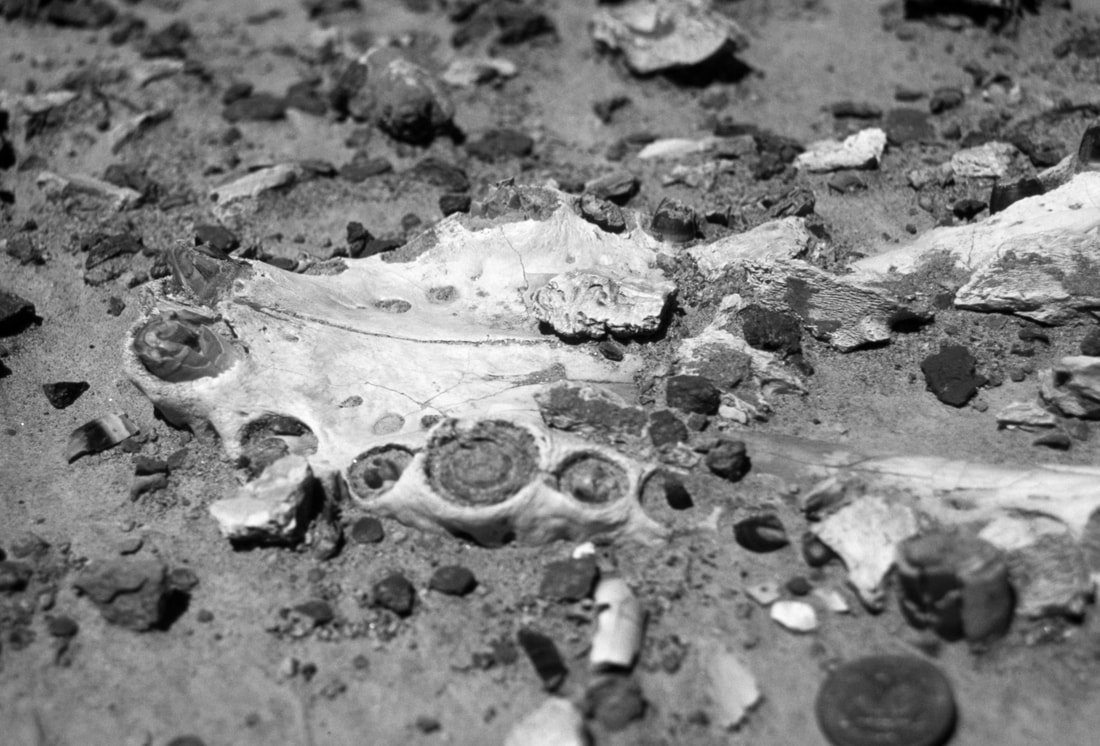
Alligatorid fossil jaw from the Eocene Washakie Basin, Wyoming. The scale here is a US quarter piece (out of focus – another thing to consider when using scales) in the bottom right. Coins were a standard scale in field photography but suffered from several limitations, (1) they vary in size, (2) they are highly reflective, which can cause exposure problems, (3) should the coin be head side up (in the UK all coins had the Queen's head, so which coin was in the photograph was not always clear)and always top up in the photograph?
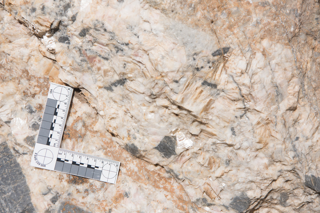
Mineral vein associated with brittle deformation in Devonian carbonates, Gistain, central Pyrenees. Here using a right-angle scale, with a circle that can be used to assess photographic distortion of the image.
5. Memory Cards, Hard-drives, and Cases
Memory cards now come in various formats for DSLR cameras, from SD, mini SD, XD, and compact flash (CF). But, of course, what you will need depends on your camera.
There are even more brands to choose from. I use SanDisk SD and CF cards and have had no major problems with these.
SanDisk Extreme PRO 32 GB SDHC Memory Card, Up to 95 MB/s, Class 10, U3, V30
How many cards you buy and which brand will also depend on your budget, as with so much else in today's blog guide.
Although memory card technology is relatively tried and tested, and problem cards are rare, I tend not to use anything bigger than a 64GB card. This mitigates the risks due to card failure and/or card loss.
An alternative approach is to download directly to a portable hard drive in the field.
Whatever storage system you use, you can further mitigate the risk of loss by uploading your photos to the cloud or backup device each evening. With the ready availability of cloud storage and access to WiFi, you should be able to do this relatively easily.
This is where smartphones can be handy if this is your primary photographic tool by having photos uploaded to the cloud whenever in 4G or WiFi range. The only issue here is the data usage cost, so check your provider's data usage policy and charges.
6. Battery Packs
If you are using your iPhone or Samsung phone for photography and especially if taking video, then you should invest in a battery pack that you can take with you in case your phone needs a recharge in the field. I use an Anker powerbank.
7. Lenses
If you have a DSLR, this opens up a range of lens options. But, again, this will be limited by budget and packing space if you are traveling. A good quality wide-angle to-zoom lens such as a 24-70mm is a good balance for most field applications. You might also want to consider a macro lens if you expect to do much close-up work. If so, then you will also want a suitable lighting system.
In the past, outcrop photos usually necessitated the use of a wide-angle lens, with the problems of distortion, but this is now mitigated by the ability to build panoramas. I use the 24mm in portrait mode with at least a 30% overlap. Some cameras and most phones will have an excellent automatic panorama generator, which is a helpful solution.
There may be occasions when you want to zoom into an outcrop distant from you. For example, I will sometimes take a 70-300mm with me if I have space, but this is heavy, and for long trips in the field this weight must be taken into consideration.
With high-resolution cameras, you can also zoom in by cropping during processing if you do not have the necessary telephoto lens. With megapixel sizes of 32MP now very common on DSLRs, this is more than feasible.
8. Tripods
A tripod is helpful but not essential, given the greater control digital cameras have over ISO, without the increase in graininess that blighted film.
For travel, I use the lightweight Manfrotto Beefree. This tripod is great, and I can highly recommend this. However, this may not be suitable if you have a large DSLR and lens.
These lightweight travel tripods are not the cheapest (and seem to have gone up in price substantially since I bought mine) so do check out the second-hand market and sales.
If you are worried about a lightweight tripod being affected by strong winds, especially if you are in the mountains, then consider using your backpack to further stabilize a tripod by hanging it below the head. This provides more mass.
The alternative to these lightweight travel tripods is a full-size professional tripod, but these will increase the weight you carry in the field, so bear this in mind.
A few years back, one of my brothers gifted me a smartphone clamp for my iPhone. Brilliant! I use this fitted to a Manfrotto MVH400AH Befree Live Fluid Head and the BeeFree tripod for shooting my new series of videos.
This is the setup I use for videos. An iPhone connected to a Sennheiser MKE 200 directional microphone on a Manfrotto BeeFree tripod. For narration, I use a Røde SmartLav+ lapel microphone rather than the Sennheiser.
9. Lighting
With most DSLRs and phone cameras, low lighting is much less of an issue than it was, say, when I made my undergraduate field trips 30+ years ago (ok, perhaps nearer 40 years ago). By increasing the ISO on your camera, you can still get relatively sharp results. Of course, this will depend on your camera, and some are better than others.
Alternative options include long shutter speeds with the camera on a tripod or using artificial lighting.
If you are doing this professionally, I am sure you will already have a range of flash guns you will take. Although for everyday field work, this will be an additional weight to carry – and a drain on your battery supply!
If you plan on taking close-ups of rock surfaces, you might consider a macro (ring) flash unit that fits on the front of your DSLR lens. A range of 3rd party units is available (check out Amazon or Wex Photo).
10. Camera bags
The problem is that you will be going into field areas with rocks, which by definition, are not good for cameras. So you need to ensure that when carrying a camera, it has plenty of protection but is also easily accessible. I have traditionally used a Lowepro camera bag, and I can recommend Lowepro in general. However, a few years back, I tried a Crumpler bag. Bright red and extremely simple (one compartment), this has actually ended up being my favorite bag for day trips in the field. However, it must be said that it is not ideal for major hiking expeditions when I return to the Lowepros!
11. Software
Most smartphones will include their own software where you can run a selection of processing. For advanced processing, consider using software such as Adobe Lightroom, which to me, is the best software for post-production and managing digital photographs. There are student pricing solutions available. If you have Lightroom, you won't need any other software (it now even has a panorama building extension).
12. Notebooks
Your camera is only one part of your toolkit. A camera does not replace the need for a notebook and pencils; indeed, you will want to keep track of your photographs in your notebook!
My personal notebook preference is still the Chartwell 2006Z top-opening survey book . Although this lacks the waterproofing and useful look-up information at the back of the Rite in the Rain Geological Notebooks, I particularly like the fact that I can open up the Chartwell notebook in landscape orientation, which gives me two pages for sketches. The 2006Z version also has two parallel lines, which provide great reference lines for sketching and logging when in portrait view.
Ensure that your notebook is a bright color in case you leave it on an outcrop and you need to find it again from a distance. Bright yellow or orange are easier to spot!
The general guidance from most field geologists is to use a pencil in the field and to generate an "inked-in version" each evening. This has the benefit of ensuring you have two copies of your notes. However, with good-quality cameras on most smartphones today, an alternative or additional safeguard is to photograph your day's notes and save this to the cloud.
Final Thoughts
As I said at the outset of this article, what photographic equipment you use in the field is very much down to your budget and personal preference.
Is an iPhone or other smartphone good enough for most student field trips? Absolutely!
Whether you use a DSLR or phone, remember about lighting, scales, and the need for context, a 'big picture' shot to capture the context and details of the rock units, fossils, and structures.
I hope this short article has been helpful. I would love to learn about your field kit experiences and recommendations.
Have fun!
A pdf version of this blog is available for download here
What can the Cenomanian-Turonian tell us about the carbon cycle?

Photo: Mowry Shale overlain by the Frontier Sandstone. North of Vernal, Utah.
Full conference information is available here: https://sepm.org/gcssepm-perkins-rosen-conference
This December, the GCSSEPM Foundation will convene the 38th Annual Perkins-Rosen Research Conference on the subject of the "The Cenomanian-Turonian Stratigraphic Interval Across the Americas: Argentina to Alaska". December 5-7, 2022, Houston, Texas.
The Cenomanian-Turonian (c.100.5-89.8 Ma, Late Cretaceous) represents a stratigraphic time interval that has intrigued me for much of my career. It encompasses periods of widespread carbon-rich sediment deposition, resulting in the sequestration of large volumes of organic carbon. The coincidence of these organic-rich rocks with a dramatic carbon isotopic excursion (Oceanic Anoxic Event - OAE-2) and the highest sea-levels of the Phanerozoic have led to hypotheses that these attributes are the result of complex interactions between the bio-, hydro- and geo-spheres that are unique to this time. But is this true? What really is going on? What was the ocean system doing? Was this a single event? Was it truly global or even globally synchronous? So many questions!
Long the focus of interest from hydrocarbon explorationists looking to understand source facies and unconventional resources, the Cenomanian-Turonian has much to tell us about the Earth System and its workings, especially the carbon cycle.
This research conference will bring together experts and data from both Industry, Academia and government to facilitate dialogue and discussion about this intriguing time interval. Oral and poster presentations will examine a wide range of topics, and there will also be a related core workshop where you can see what this interval looks like in the rock record.
There will also be a related core workshop you can register for, where you can see what this interval looks like in the rock record.
If you would like to learn more about this research conference, you can find further information here: https://sepm.org/gcssepm-perkins-rosen-conference
For information about sponsorship opportunities, please get in touch directly with Dr. John Suter, Executive Director GCSSEPM Foundation at gcssemp1@gmail.com.
And of course, you can also contact me at paul.markwick@knowing.earth
We gratefully acknowledge the support of Equinor, who are kindly hosting this event.
Mapping the Earth’s structural framework
Paul Markwick
As geologists, we all ‘know’ what a structural map is – the map representation of the geometry and kinematics of folds and faults. Nothing could be simpler. So, when John Jacques and I established the Petroleum Systems Evaluation Group (PSEG) at Getech back in 2004, building the structural framework for each of our new regional studies seemed the least of our worries. But, to our surprise, we were wrong. It turned out that not every structural geologist sees structural mapping in the same way. And as for the geophysicist view of structures… well, that is a story for another day. This was to cost us much time and monies. The question is, why?
Faults and folds are amongst the clearest expressions of past tectonics that we can observe directly.
The graphical representation of these features depends on application and scale.
On geological maps, structural elements are usually shown by lines. These mark the trace of the intersection of each structural feature with the Earth’s surface. Kinematics are represented graphically by a commonly applied symbology (Figure 1). In many structural maps, sub-surface features are also represented by extending their top trace vertically until it intersects the current land surface (in our databases, we use an attribute to distinguish between features exposed at the surface and those in the sub-surface). This combination of line features is what John and I had in mind, given our focus on New Ventures exploration and how we would use the framework: to define the crustal architecture, build tectonic models and then develop paleogeographies.
When we get to prospect scale (Figure 2), it becomes essential to consider the 3D geometry to calculate volumetrics, investigate fault closure, trapping mechanisms, migration pathways, etc. To this end, we build structural contour maps and show our faults at the surface as polygons representing the dip and throw of each fault plane with depth.
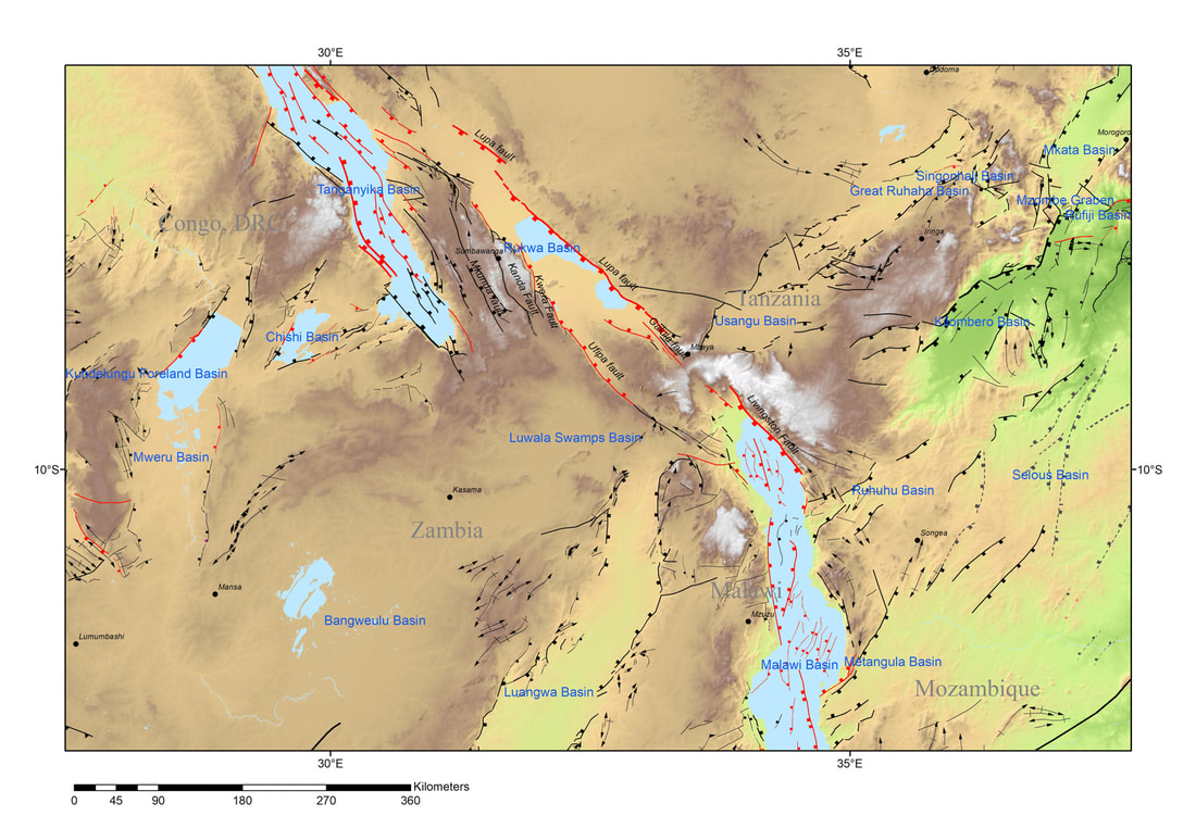
Figure 1. An example of the data in our Structural Elements database for the area around Rukwa and northern Malawi. Features are represented by lines that mark the trace of faults at the surface (or projected up from their highest expression for subsurface faults) and axes of folds. When I think of a structural map in New Ventures exploration or most of my academic work, this is what I think of.
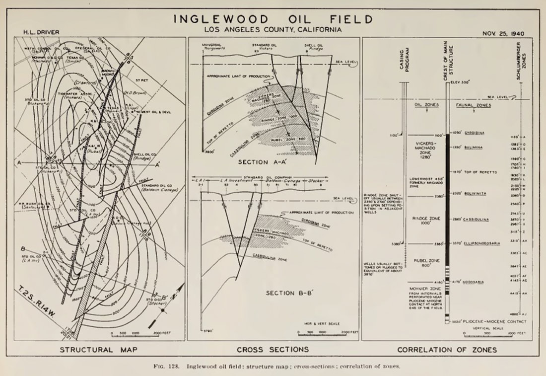
Figure 2. An example of a prospect-scale map, in this case, a vintage map of the Inglewood oil field in California. The structural map (left) includes structural contours and faults as polygons to show the geometry of dip and throw (Jenkins, 1943)
This difference due to application and scale is nothing new. It was also not the cause of the problems that John and I faced.
I have been thinking about this recently. Primarily because I am once again building a global crustal architecture geospatial database, this time armed with 30 years of experience, much older and hopefully a little wiser. But also, because I am writing a new paper on the history of geological representation.
Much has changed since 2004. For example, our understanding of the complexity of crustal architecture has developed substantially in the last decade due to the increased availability of ultra-deep, 2D seismic data along many of the world’s continental margins (Manatschal, Sutra and Péron-Pinvidic, 2010; Péron-Pinvidic and Manatschal, 2009). Databases and map representations need to take account of these advances.
The new databases I am working on are more systematic, more integrated, more detailed, and based on more data. The workflow begins with the Structural Elements database, forming the framework around which all the other elements are built. Hence the reference to a structural ‘framework’. So, getting this database right, or as correct as possible, is critical because everything else hangs from this. Everything from the crustal facies and geodynamics databases to how we define our sedimentary basins and their depositional fill, and ultimately to plate reconstructions, paleogeography, and paleolandscapes.
In revisiting this whole process and detailing the mapping workflow, I realized that some questions need to be explicitly addressed from the outset if we are to get others, not least our staff, to know what we want. These questions include the following:
The answers to these are relatively straightforward once stated (answers at the end of the article) – operationally, these are now addressed in the extensive documentation created for each database.
In this blog, I want to look at the history of structural mapping as a way to try and explain the problems that John and I encountered. Because by looking at this history, we can hopefully get closer to answering the fundamental question: What is a structural map?
I have been thinking about this recently. Primarily because I am once again building a global crustal architecture geospatial database, this time armed with 30 years of experience, much older and hopefully a little wiser. But also, because I am writing a new paper on the history of geological representation.
Much has changed since 2004. For example, our understanding of the complexity of crustal architecture has developed substantially in the last decade due to the increased availability of ultra-deep, 2D seismic data along many of the world’s continental margins (Manatschal, Sutra and Péron-Pinvidic, 2010; Péron-Pinvidic and Manatschal, 2009). Databases and map representations need to take account of these advances.
The new databases I am working on are more systematic, more integrated, more detailed, and based on more data. The workflow begins with the Structural Elements database, forming the framework around which all the other elements are built. Hence the reference to a structural ‘framework’. So, getting this database right, or as correct as possible, is critical because everything else hangs from this. Everything from the crustal facies and geodynamics databases to how we define our sedimentary basins and their depositional fill, and ultimately to plate reconstructions, paleogeography, and paleolandscapes.
In revisiting this whole process and detailing the mapping workflow, I realized that some questions need to be explicitly addressed from the outset if we are to get others, not least our staff, to know what we want. These questions include the following:
- Should the maps be based on map interpretations published by other people (secondary data) or interpreted from primary data?
- Should we assume that existing interpretations are correct?
- What density of structures should be mapped?
- Should only features with a direct link to petroleum be recorded?
- Should the maps only show the present-day geometry of features or show the past geometry at a time of the compilers' choosing/interest?
- Should the maps be schematic with segments linked into a continuous form (general pattern of faults and folds) or only what is ‘observed’ (actual or as close to reality as possible)?
The answers to these are relatively straightforward once stated (answers at the end of the article) – operationally, these are now addressed in the extensive documentation created for each database.
In this blog, I want to look at the history of structural mapping as a way to try and explain the problems that John and I encountered. Because by looking at this history, we can hopefully get closer to answering the fundamental question: What is a structural map?
The ‘architecture’ of the Earth
When Thomas Sterry Hunt first described the process of making his paleogeographic maps in his 1873 paper (Hunt, 1873), he stressed the importance of first understanding the underlying “architecture [of the Earth]”
“The structure and arrangement of the materials of the earth’s crust, its architecture, as it were…”
In this, Hunt was likely influenced by his experience as an exploration geologist and how structure often dictated the distribution of oil – Hunt was one of the first to recognize the link between anticlinal structures and oil fields (Hunt, 1862).
Crustal ‘architecture’ is much more than mapping the structural ‘framework’ as a structural elements database. It encompasses all the crust. In reading back through the early 19th century literature, it is clear that when geologists referred to ‘structure’, they were using it in the same way as Hunt used [crustal] “architecture”. Indeed mapping faults and fold axes as lines developed relatively late in geology.
Folding and faulting showed how dynamic the Earth was. You only have to read Humboldt, Hutton, or Lyell to get a sense of this. But when these geologists came to map this deformation, the resulting ‘structure’ was defined by outcrop geometry in map view or bed orientation in sections, rather than by discrete fault lines and planes. The maps of Smith, for example, show outcrop geometries that define folds and faulted boundaries but do not show the fold axes or faults themselves. Similarly, his cross-sections.
So in this 19th-century view of a ‘structural map,’ we are not just representing the trace of fold axes or faults but the entire 3-dimensional crustal form. In terms of the databases I am building today, this would require three separate but related databases: (1) structural elements, which define the three-dimensional geometry of the rock volume, including folds and faults as a framework of line traces; (2) 'crustal' facies describing the geometry and composition/rheology of the lithosphere; and (3) bedrock geology, comprising the surface outcrop. We might add (4) igneous features; and (5) geodynamics, representing the dominant thermo-mechanical processes acting on the lithosphere. Both of these give additional information on the dynamic processes that generate the form.
De La Beche and faults as lines
It was Henry De La Beche who explicitly showed faults as lines in his sections (De la Beche, 1830). These thick black lines in sections (Fig.3) were replaced in map view by thick white lines. This symbology continued to be used on British maps throughout the 19th century (Fig. 4). There was no differentiation between different types of faults.
But a search of 19th century maps suggests that the inclusion of fault traces was not universal. Even Élisee Reclus in his seminal work on global geography, did not show maps of major fault lines, although he did provide maps of the East African rift, showing the topographic fault scarps (“Line of Volcanic Fault” (Fig.104 in Reclus, 1876).
But a search of 19th century maps suggests that the inclusion of fault traces was not universal. Even Élisee Reclus in his seminal work on global geography, did not show maps of major fault lines, although he did provide maps of the East African rift, showing the topographic fault scarps (“Line of Volcanic Fault” (Fig.104 in Reclus, 1876).
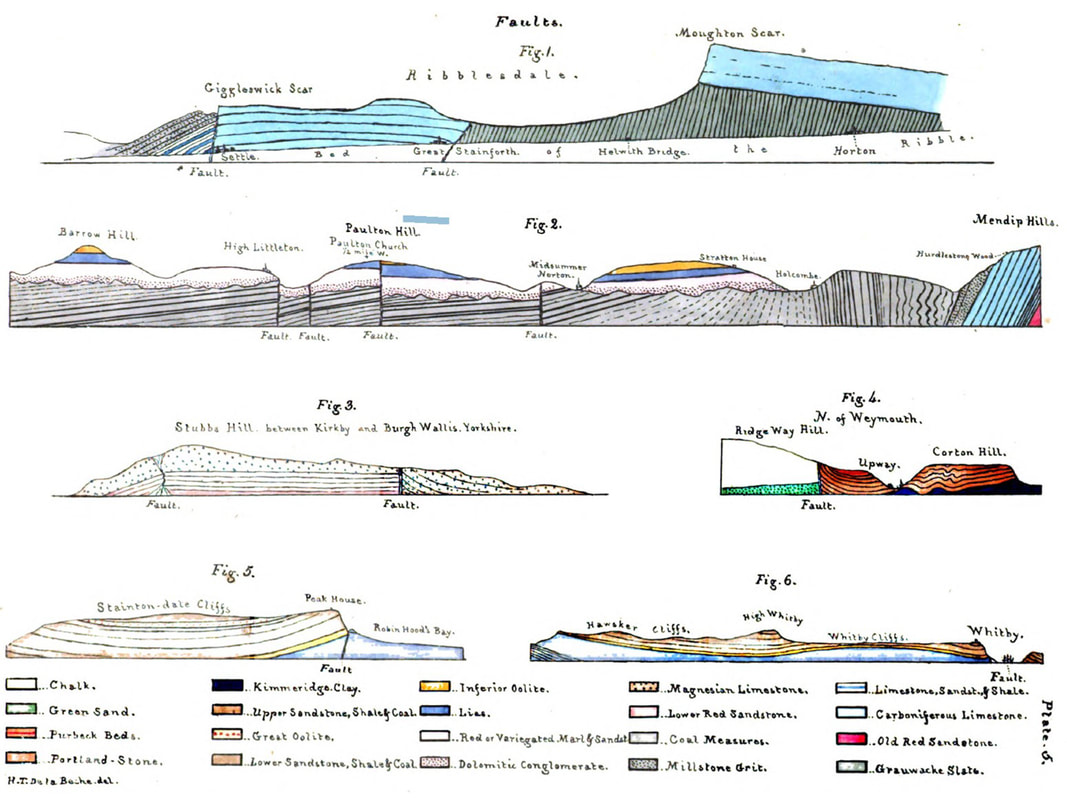
Figure 3. Examples of faults shown in De la Beche cross-sections from various locations in the United Kingdom (De la Beche, 1830)
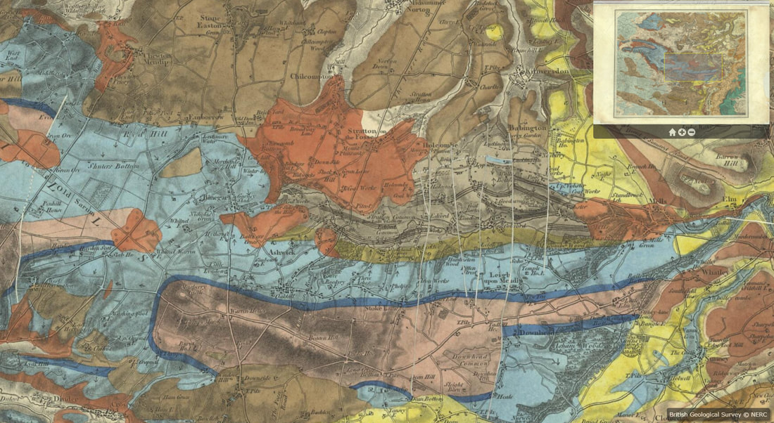
Figure 4. An example of mapped faults represented by white lines on this map of the Mendips by De la Beche (1845). British Geological Survey materials © UKRI (1845) http://www.largeimages.bgs.ac.uk/iip/mapsportal.html?id=1000027
John Wesley Powell and the Standardization of Geological Maps
The most significant change in structural mapping occurred in the 1880s, when John Wesley Powell, the second director of the newly formed USGS, started a drive to standardize map symbology and colors. In these maps, Powell explicitly showed structural elements (Powell, 1882), but like De la Beche, these were heavy black lines without associated markers. Powell also used dashed lines to show fault extents where the trace could not be discerned but was assumed to continue. Forty years earlier, De la Beche had also shown dashed fault lines on some of his maps, but had not explained what these meant in the legend; one assumes to show uncertainty like Powell:
“Fault lines (particularly when they are formation boundaries) shall be indicated when actually traced by somewhat heavy full lines in black; and when not actually traced, by similar broken lines, toward which the formation devices may blend or fade as circumstances seem to require.”
(Powell, 1890)
This standardized approach to mapping was implemented under the auspices of the next USGS Director, Charles Doolittle Walcott. The results can be seen in the USGS “Folios of the Geologic Atlas of the United States”, a series published between 1894 and 1945, which included maps of topography and geology with an emphasis on structure and economic geology (see Figure 5 for an example from the Little Belt Mountains in Montana; Weed, 1899). Some of these folios also included structural contours on the maps (see Figure 6 from Clapp, 1907).
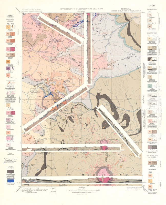
Figure 5. An example map from the Folios of the Geological Atlas of the United States. In this example from 1899, faults are represented by solid and dashed black lines following the guidelines laid down by Powell in the 1880s. The inclusion of sections on the map is unusual but emphasizes an increasing focus on geological maps for resource exploration. Note that the map title now includes the term “Structure”.
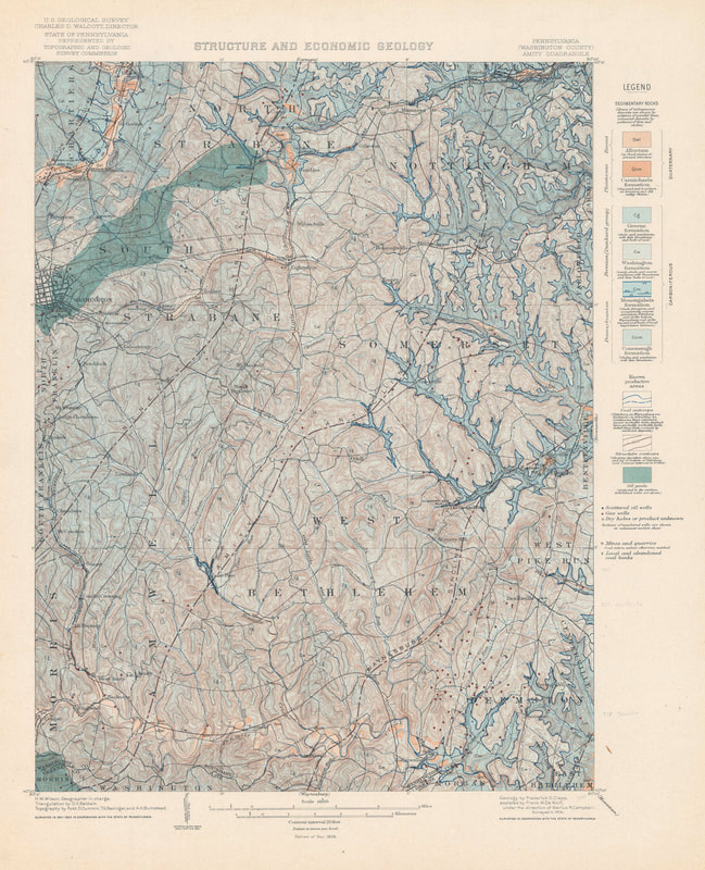
Figure 6. In this map from the “Folios of the Geological Atlas of the United States” series, the geologists have included structural contours in addition to stratigraphy, lithology, and structure (Clapp, 1907)
The folios of Walcott during at the turn of the 19th-20th centuries look remarkable modern. But this ‘standard’ symbology does not seem to have been systematically adopted more widely outside of the U.S.. The British Geological Survey continued to mostly use white lines to represent faults until around 1912, after which they were changed to darker colors such as dark browns (Fowler et al., 1926) or dark blue lines (Ussher and De la Beche, 1953) (Figure 7). Although Strahan’s geological map of Ingleborough in 1910 (Strahan, 1910) users black lines and is more similar to Powell's scheme and the USGS folios.
 |  |
Figure 7. White solid lines continued to be used by the British Geological Survey until at least 1912 (left)(Ussher and De la Beche, 1912). Subsequent editions such as this reprint from 1953 (Ussher and De la Beche, 1953) show faults in dark blue (right image). This was not universal with Strahan’s map of Ingleborough in 1910 representing faults with black solid lines (Strahan, 1910). British Geological Survey materials © UKRI (1912) British Geological Survey (BGS) | large image viewer | IIPMooViewer 2.0 and (1953) British Geological Survey (BGS) | large image viewer | IIPMooViewer 2.0 (this is actually the 1962 reprint of the 1953 map)
The nomenclature of Powell was expanded in 1920, when the USGS published formal guidance to its geologists on how to prepare illustrations and maps (Ridgway, 1920). Faults on maps were now represented by lines with associated marker symbols to indicate the footwall and hanging wall sides of normal faults, and overthrust (upper plate) side of thrusts. Anticlines and synclines were represented by a line along the fold axis, differentiated by arrows perpendicular to the line - a symbology that has changed little since (Figure 8).
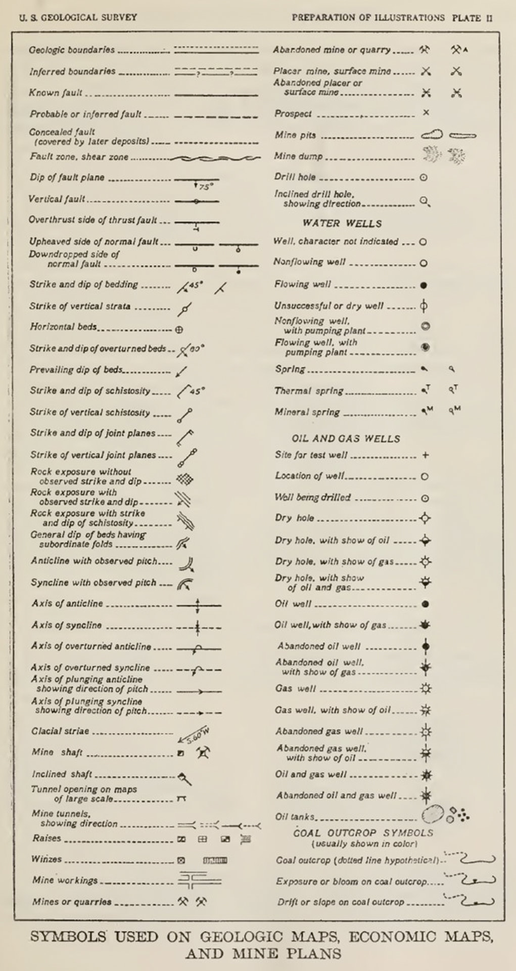
Figure 8. The map symbol set presented by the USGS in 1920 (Ridgway, 1920)
This map nomenclature was quickly adopted and most clearly exemplified in the detailed local USGS maps of the time, for example, the excellent 1929 geological map of the Tyrone quadrangle in Pennsylvania (Figure 9) in which thrust faults, normal faults, synclines, and anticlines were differentiated (Butts, 1929). In Britain, the 1:63,360 map of Norham used a tick mark to denote the downthrown side of faults (Fowler et al., 1926). But we can also see its use in exploration maps during the following decades (Figure 10). And it was the oil Industry that then started to drive the need for more significant differentiation in the structural elements symbol set.
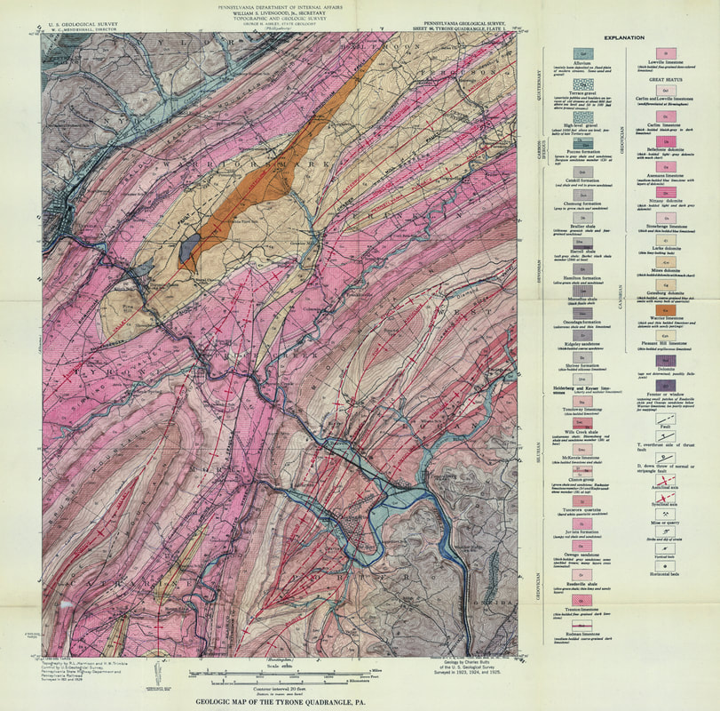
Figure 9. The 1929 geological map of the Tyrone quadrangle in Pennsylvania (Butts, 1929). Note the use of different symbols for anticlines, synclines, normal and thrust faults. Many of the fold axes are named. Image made available online courtesy of the Pennsylvania State University.
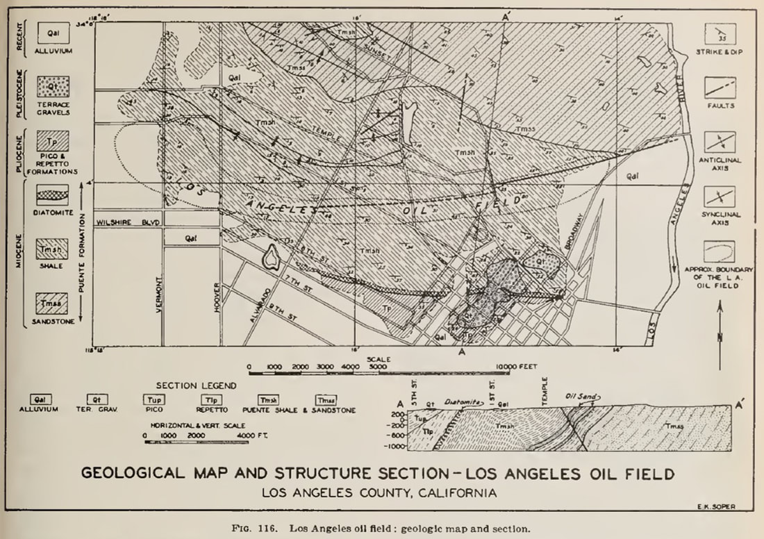
Figure 10. The Los Angeles City Oil field showing fold axes and faults in the 1940s (Jenkins, 1943)
The need for more symbols
It was becoming clear that there was a much greater diversity of structural models – different fold and fault types - that needed to be represented graphically (Boyer and Muehlberger, 1960; Crowell, 1959; Davis, 1913; Hill, 1947; Hubbert, 1927; Reid et al., 1913; Sopwith, 1875; Straley III, 1934).
In 1950 the USGS expanded the range of recommended fold and fault symbols (Cloos et al., 1950), including many that we still use today. But it still lacked the diversity of symbols that we use today. It also restricted some symbols to specific types of maps (Figure 11).
In 1950 the USGS expanded the range of recommended fold and fault symbols (Cloos et al., 1950), including many that we still use today. But it still lacked the diversity of symbols that we use today. It also restricted some symbols to specific types of maps (Figure 11).
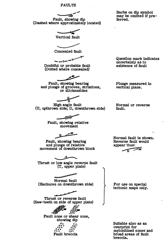
Figure 11. The additional fault symbols suggested by Cloos et al. (1950) for the USGS. It is interesting to note that although the saw-tooth marker symbol for thrust and reverse faults is illustrated, it is only "for use on special tectonic maps".
From 1989 to 1995, the USGS built a more extensive cartographic standard map symbol (Reynolds, Queen and Taylor, 1995; Soller, 1996). In this version, all thrust faults were represented using the saw-tooth marker pattern, which is now the most widely used visualization. Normal faults were still represented by a tick mark to indicate the downthrown side. This was further expanded with the 2006 update to the USGS symbol set (Federal Geographic Data Committee, 2006). However, confusingly here, the USGS chose to represent normal faults with half-circles indicating the downthrown side and rectangles to represent the upthrown block of reverse faults. Unfortunately, by this time, other structural geologists and many companies had already appropriated the idea of using rectangle markers but to replace the tick marks on normal faults (Hulshof, 2012; Markwick, 2019); this included Robertson Research in the late 1990s, which is where I got into the habit. Other organizations, such as the BGS, continue to use tick marks (Mawer, 2002).
With this diversity of map symbols, we can create a more detailed map of the ‘structural framework’ built of structural elements. These are the map representations of the structure rather than the whole structural form: a fold axis, not the entire fold form, a fault trace at the surface (or top sub-surface fault trace), not the whole fault plane. It is these elements that are recorded in our Structural Elements database.
This distinction may seem like semantics. But it is important, and as we stressed at the beginning of this article, it is a function of the application. In New Ventures exploration or plate modeling or paleogeography, we need to understand the overall structural context and what it tells us about geodynamic evolution, whether for basins or basin hinterland. But at the prospect scale, we need to understand the form.
This explains why we distinguish between the “structural framework” and the “crustal architecture” of which the framework is an integral part in our paleogeographic workflow.
A further complication here is that when we talk about ‘crustal’ architecture, we are, of course, referring to the whole lithosphere - nothing is ever simple!
We all know what a structural map is. Don't we?
So, what was the cause of the problems that John and I had?
In truth, even with 15 years of hindsight, I still do not fully understand the causes. But I think I have more of an idea than I did then.
What is a structural map? When looking at the example in figure 1, everything seems obvious. John and I had assumed that all structural geologists saw a structural map, in the same way, especially the most experienced structural geologists, those with the most years. But what they ‘knew’ and we ‘knew’ turned out not to be the same.
In our defense, I should point out that we ultimately hired a brilliant Polish structural geologist, whose tectonic model of SE Asia is, I still think, one of the best solutions I have seen for that area. And then a series of excellent MSc graduates who all immediately understood what we meant. So perhaps it was also partly the individuals concerned after all? Perhaps…
Structural mapping is fundamental to solving geological problems, especially in resource exploration. Getting the structural framework right impacts everything else, which we then build upon it.
As geologists, we all ‘know’ what a structural map is. But what we ‘know’ has changed through time, depends on the application, and, as it turns out, it may also depend on the geologist you ask.
So what have I learned? Always explicitly define what you mean and assume nothing.
Further Information
If you would like to learn more about the Knowing Earth suite of structural and crustal architecture databases or any of our other Knowing Earth databases, please contact me at paul.markwick@knowing.earth.
This blog is part of a longer paper on the history of structural mapping that will be presented later this year.
The first version of the cartographic symbol set used by Knowing Earth was published as part of Markwick (2019) and is available through the Geological Magazine website https://www.cambridge.org/core/journals/geological-magazine/article/abs/palaeogeography-in-exploration/444CC2544340A699A01539A2D4C6E92A
The associated ArcGIS style file can be downloaded from my research website: www.palaeogeography.net
We will be publishing our new 2021 version shortly.
Others symbol sets available on-line.
USGS: https://ngmdb.usgs.gov/fgdc_gds/geolsymstd/download.php
BGS: http://nora.nerc.ac.uk/id/eprint/3221/1/RR01001.pdf
Shell: https://www.arcgis.com/home/item.html?id=8a89e7ffe4154efa94c65090c4dab485
Knowing Earth: http://www.palaeogeography.net/publications.html
References cited
Boyer, R. E. & Muehlberger, W. R. 1960. Seperation versus slip. AAPG Bulletin 44, 1938-39.
Butts, C. 1929. Geologic map of the Tyrone quadrangle, Pa. Harrisburg, Pa.: Pennsylvania Bureau of Topographic and Geologic Survey.
Clapp, F. G. 1907. 144. Amity folio, Pennsylvania. In Folios of the Geologic Atlas: USGS.
Cloos, E., Pusey, L. B., Rubey, W. W. & Goddard, E. N. 1950. New list of map symbols: [for use in publications of the Geological Survey]. p. 6. Washington, D.C.: United States Geological Survey.
Crowell, J. C. 1959. Problems of fault nomenclature. Bulletin of the American Association of Petroleum Geologists 43 (11), 2653-74.
Davis, W. M. 1913. Nomenclature of surface forms on faulted structures. GSA Bulletin 24 (1), 187-216.
De la Beche, H. T. 1830. Sections & views, illustrative of geological phaenomena. London: Treuttel & Würtz, 71 pp.
De la Beche, H. T. 1845. 1:63,360 geological map series [Old Series] Sheet 19, [Bath, Frome, Axbridge, Wells, Glastonbury, Bruton, Mere, Somerset Coalfield, and southern part of Bristol Coalfield.] , Solid. Geological Survey of England and Wales.
Federal Geographic Data Committee 2006. FGDC digital cartographic standard for geologic map symbolization. p. 290. Reston, VA.: Prepared for the Federal Geographic Data Committee by the U.S. Geological Survey.
Fowler, A., Carruthers, R. G., Geikie, A. & Gunn, W. 1926. 1:63,360 geological map series [New Series] Sheet 1, Norham, Drift. Revised. Geological Survey of England and Wales.
Hill, M. L. 1947. Classification of Faults. AAPG Bulletin 31 (9), 1669-73.
Hubbert, M. K. 1927. A suggestion for the simplifcation of fault descriptions. The Journal of Geology 35 (3), 264–69.
Hulshof, B. 2012. Shell Standard Legend. p. 38. Amsterdam: Shell Global Solutions International B.V.
Hunt, T. S. 1862. Notes on the history of petroleum or rock oil. In Annual report of the board of regents of the Smithsonian Institution, showing the operations, expenditures, and condition of the institution for the year 1861 pp. 319-29. Washington, D.C.: Government Printing Office.
Hunt, T. S. 1873. The paleogeography of the North-American continent. Journal of the American Geographical Society of New York 4, 416-31.
Jenkins, O. P. 1943. Geologic formations and economic development of the oil and gas fields of California (In Four Parts, Including Outline Geologic Map Showing Oil and Gas Fields and Drilled Areas). In California Department of Natural Resources, Division of Mines, Bulletin p. 773. California Department of Natural Resources, Division of Mines.
Manatschal, G., Sutra, E. & Péron-Pinvidic, G. 2010. The lesson from the Iberia-Newfoundland rifted margins: how applicable is it to other rifted margins? In Central & North Atlantic Conjugate Margins Conference Lisbon.
Markwick, P. J. 2019. Palaeogeography in exploration. Geological Magazine (London) 156 (2), 366-407.
Mawer, C. H. 2002. Cartographic standard geological symbol index, Version 3. p. 49. Keyworth, Nottingham: British Geological Survey.
Péron-Pinvidic, G. & Manatschal, G. 2009. The final rifting evolution at deep magma-poor passive margins from Iberia-Newfoundland: a new point of view. International Journal of Earth Sciences (Geologische Rundsch) 98 (7), 1581-97.
Powell, J. W. 1882. Second Annual report of the United States Geological Survey to the Secretary of the Interior, 1880-1881. In Annual Report p. 764. United States Geological Survey.
Powell, J. W. 1890. Tenth Annual report of the United States Geological Survey to the Secretary of the Interior, Part 1: 1888-1889. In Annual Report p. 774. United States Geological Survey.
Reclus, É. 1876. The universal geography : the earth and its inhabitants. vol. XIII. South and East Africa. London: J.S. Virtue & Co., Limited, pp.
Reid, H. F., Davis, W. M., Lawson, A. C. & Ransome, F. L. 1913. Report of the committee on the nomenclature of faults. GSA Bulletin 24 (1), 163-86.
Reynolds, M. W., Queen, J. E. & Taylor, R. B. 1995. Cartographic and digital standard for geologic map information. In USGS Open-File Report p. 257. USGS.
Ridgway, J. L. 1920. The preparation of illustrations for reports of the United States Geological survey : with brief descriptions of processes of reproduction. p. 101. Washington, D.C.: United States Geological Survey.
Soller, D. R. 1996. Review of USGS Open-file Report 95-525 ("Cartographic and digital standard for geologic map information") and plans for development of Federal draft standards for geologic map information. In USGS Open-File Report p. 12. U.S. Geological Survey.
Sopwith, T. 1875. Description of a Series of Elementary Geological Models Illustrating the Nature of Stratification ... with Notes on the Construction of Large Geological Models. R.J. Mitchell & Sons, 82 pp.
Strahan, A. 1910. Guide to the Geological Model of Ingleborough and District. pp.
Straley III, H. W. 1934. Some notes on the nomenclature of faults. The Journal of Geology 42 (7), 756-63.
Ussher, W. A. E. & De la Beche, H. T. 1912. 1:63,360 geological map series [New Series] Sheet 350, Torquay, Drift. With additions. Geological Survey of England and Wales.
Ussher, W. A. E. & De la Beche, H. T. 1953. 1:63,360 geological map series [New Series] Sheet 350, Torquay, Drift. With additions. Reprint. Geological Survey of England and Wales.
Weed, W. H. 1899. 56. Little Belt Mountains folio, Montana. In Folios of the Geologic Atlas: USGS.
Answers to the questions
Q1. Should the maps be based on published maps (secondary data) or interpreted from primary data?
Answer. The intention is that all structural features in the database should be identified in primary data. This data includes gravity and magnetic data, seismic, radar, bathymetry, topography, Landsat, and observations. Features from secondary (published) data are only included if the feature is considered important but cannot be seen with primary data available (remember that the primary data are all publicly available). In these cases, the feature will carry by default a low mapping confidence and will have attribution reflecting its source. We have kept such ‘secondary’ interpretations to a minimum (<<1% of the entire database).
Q2. Should we assume that existing interpretations are correct?
Answer. Assume nothing. Generally, the location of a feature would have been placed using primary data and information from published, secondary sources will refer to the age assignments or kinematic histories. Attribution is used in the database to explain the source of this information – i.e., what it is based on if quoted in a paper.
Q3. What density of structures should be mapped?
Answer. This will depend on the data grain and structural complexity. Map what you can see, but consider a set resolution limit and keep to that. This becomes the “minimum resolvable feature” in the database. In operation, there is a clear density difference between features mapped on land using Landsat or SRTM3 radar data and features in the oceans constrained only by satellite-derived gravity anomalies.
Q4. Should only features with a direct link to petroleum be recorded?
Answer. No. This database is about understanding the Earth so not restricted to any single application.
Q5. Should the maps only show the present-day geometry of features or show the past geometry at a time of the compilers' choosing/interest?
Answer. The default database is the present-day geometry. Separate databases are used for each geological timeslice starting with features extracted from the present-day database and rotated. Changes in kinematics are stored in a related “Activation” table. Also, be aware that there will be cases where features will need to be spatially adjusted after rotation to reflect deformation (palinspastic reconstruction), especially in compressional settings. In the oceans, there may also be features that no longer exist (subducted).
Q6. Should the maps be schematic with segments linked into a continuous form (general pattern of faults and folds) or only what is ‘observed’ (actual or as close to reality as possible)?
Answer. Observed takes precedence, but connections may sometimes be useful. If so, connections will have the lowest confidence and be dashed. This is why attribution is so crucial.
A pdf version of this blog is available for download here
The importance of knowing your data

“Data, data, data! I cannot make bricks without clay!” Good old Sherlock, a quote for every occasion… ("The Adventure of the Copper Beeches" Sir Arthur Conan Doyle, 1892)
We in the 21st Century have access to a huge volume of data. More than any generation before us. And with each day that volume of data grows ever larger.
One of the many consequences of the COVID-19 pandemic has been the continuous news coverage stressing the importance of data. We are regaled daily with graphs and statistics that I imagine few people understand or want to understand.
The challenge with all data is working out which are worth using and how to best use this. It is about knowing your data.
In the age of AI (Artificial Intelligence) and machine learning, there is a temptation to assume that all we need to do is to ‘train’ our software, load in the data, and wait for the answer.
“42” instantly comes to mind - for those of you old enough to remember the prescient imagination of Douglas Adams and “The Hitchhikers Guide to the Universe”.
There is no question that both AI and machine learning have a huge potential in helping us better understand the world. Computers provide us with the capability to interrogate the vastness of our data libraries and to draw out patterns and conclusions that we would otherwise not have the time to do. The developments in these techniques are impressive. If you are not convinced check out the Google AI site (https://ai.google/).
But we need to be careful.
Not because AI is not useful, it is. But because there are fundamental issues around data and analytics that we must answer first:
Each merits an essay in its own right.
Here, I am going to focus on the third – do we trust our data?
“42” instantly comes to mind - for those of you old enough to remember the prescient imagination of Douglas Adams and “The Hitchhikers Guide to the Universe”.
There is no question that both AI and machine learning have a huge potential in helping us better understand the world. Computers provide us with the capability to interrogate the vastness of our data libraries and to draw out patterns and conclusions that we would otherwise not have the time to do. The developments in these techniques are impressive. If you are not convinced check out the Google AI site (https://ai.google/).
But we need to be careful.
Not because AI is not useful, it is. But because there are fundamental issues around data and analytics that we must answer first:
- Are we clear about the question(s) we are asking of our data and software? (Douglas Adams’ premise in Hitch-hikers).
- Will we be able to understand the answers when we get them?
- Do we trust our data?
Each merits an essay in its own right.
Here, I am going to focus on the third – do we trust our data?

Figure 1. We in the 21st Century have access to a huge volume of data. In the last 40 years, we have seen the transition of that data from physical libraries, as illustrated here by a suite of bound scientific papers in my library, to the “1s” and “0s” of the digital age
Data, data, data
I have spent much of my career designing, building, populating, managing, and analyzing ‘big data’. From using paleobiological observations to investigate global extinction and biodiversity, to testing climate model experiments, to paleogeography, and petroleum and minerals exploration.
Having worked at each stage from data collection to data analytics I have gained a unique insight into data, especially big data.
Most databases are built to address specific problems, and no surprise, these rarely give us insights beyond the questions originally asked.
But when we think of Big Data and AI we are usually thinking of large, diverse datasets with which to explore, to look for patterns and relationships we did not anticipate.
My interest has always been in building these sorts of large, diverse ‘exploratory’ databases following in the footsteps of some great mentors I was privileged to have at The University of Chicago, the late Jack Sepkoski, and my Ph.D. advisor Fred Ziegler.
‘Exploratory’ databases have their own inherent challenges, not least the need to ensure that they include information that can address questions that the author has not yet thought of… That is a major problem.
This requires specific design considerations, especially, as I argue you here, the fundamental importance of ensuring that we know the source and quality of the data we are using. Because it is upon these data that we base our interpretations, and from those interpretations the understanding and insights we derive.
If the data are flawed then everything we do with that data is similarly flawed and we have wasted our time.
This is even more important when we are analyzing 3rd party databases that we have not built ourselves. How far can we, should we trust them?
In short, we can have the best AI system in the world and the most powerful computers, but if the data we feed the system is rubbish, then all we will get out is rubbish.
What do we mean by data?
In discussing data and databases it has become de rigueur to quote Conan Doyle: “Data, data, data! I cannot make bricks without clay!” Good old Sherlock, a quote for every occasion… ("The Adventure of the Copper Beeches" Sir Arthur Conan Doyle, 1892)
But what do we mean by “data”?
When I started to write this article, I thought I knew.
But in looking through the literature I soon realized that such terms as “data”, “Big data” and “information” were vaguely defined and used interchangeably.
So, to help anyone else in the same position here is a quick look at the terminology, including some that you may or may not be familiar with. This is summarised in figure 1. A more comprehensive set of definitions is provided as supplementary data in the pdf version of this blog article.
Figure 2. The relationship between data, information, knowledge, understanding, and insight. This summary figure shows the problem of current definitions (see supplementary data for further information)
The fundamental progression here is from data to verified data to knowledge, understanding, and insight (see the recent Linkedin article by the branding company LittleBigFish).
Admittedly, in many ways trying to define the relationships between observations, facts, data and information is semantics.
For databasing we can reduce this to data and verified data, and this takes us back to the need to audit and qualify our data: the data to verified data transition.
Admittedly, in many ways trying to define the relationships between observations, facts, data and information is semantics.
For databasing we can reduce this to data and verified data, and this takes us back to the need to audit and qualify our data: the data to verified data transition.
The audit trail: Recording Data Provenance and Explanation
When designing and building a database we need to ensure that we include information about the data.
For spatial geological data, we need to answer a range of questions about the data, including the following:
(For further information on this see Markwick & Lupia (2002)
Providing the answers to these questions will enable anyone using the database to replicate what was done and to make decisions on how they use the data.
Where this applies to the database as a whole it will be recorded within the metadata. The metadata also provides information on the intrinsic characteristics of the data in a database, such as data type, field size, date created, etc.
This is different from extrinsic information, such as the input data used for a specific database record. This extrinsic, record specific information is stored within the data tables themselves. For example, in our Structural Elements Database (see figure 3 attribute table), features may be based on an interpretation of one of several primary datasets, including Landsat imagery, radar data, gravity, magnetics, and seismic. This needs to be recorded because each primary dataset will have its inherent resolution and errors.
I have always believed that more explanation is required. So, within my own commercial and research databases, I have added text fields for each major inputs to describe the basis of each interpretation. For example, an “Explanation” field provides a place for describing exactly how a spatial feature was defined.
All records are then linked to a reference library through unique identifiers (Markwick, 1996; Markwick and Lupia, 2002). This is a relatively standard design. (Nb. In my research, I use the Endnote software, which I have used since my Ph.D. days in Chicago in the 1990s and which I can highly recommend https://endnote.com/)
For spatial geological data, we need to answer a range of questions about the data, including the following:
- What is the provenance of the data?
- What is the resolution of the data?
- What is the type of data?
- What is the data grain?
- What is the spatial and temporal accuracy?
- What is the spatial and temporal precision?
- What is the analytical technique used?
- What is the analytic error?
- If an interpretation what is it based on and why?
(For further information on this see Markwick & Lupia (2002)
Providing the answers to these questions will enable anyone using the database to replicate what was done and to make decisions on how they use the data.
Where this applies to the database as a whole it will be recorded within the metadata. The metadata also provides information on the intrinsic characteristics of the data in a database, such as data type, field size, date created, etc.
This is different from extrinsic information, such as the input data used for a specific database record. This extrinsic, record specific information is stored within the data tables themselves. For example, in our Structural Elements Database (see figure 3 attribute table), features may be based on an interpretation of one of several primary datasets, including Landsat imagery, radar data, gravity, magnetics, and seismic. This needs to be recorded because each primary dataset will have its inherent resolution and errors.
I have always believed that more explanation is required. So, within my own commercial and research databases, I have added text fields for each major inputs to describe the basis of each interpretation. For example, an “Explanation” field provides a place for describing exactly how a spatial feature was defined.
All records are then linked to a reference library through unique identifiers (Markwick, 1996; Markwick and Lupia, 2002). This is a relatively standard design. (Nb. In my research, I use the Endnote software, which I have used since my Ph.D. days in Chicago in the 1990s and which I can highly recommend https://endnote.com/)
Figure 3. The main attribute table for the Structural Elements database showing in red those fields used to qualify and/or audit each record. Of 38 fields 20 store information that qualifies the entry. In addition, there is the metadata, data documentation, and underlying data management system and workflows.
The problem for database design is knowing what level of auditing is needed to adequately qualify an individual record. This will depend on whether the record is of a primary observation – analytical, field measurement, etc – or an interpretation.
Interpretations can change with time. For example, a biostratigraphic zonation used 30 years ago may not be valid today, but the primary observations of which organisms are present may still be true (accepting that taxonomic assignments may also change). So in a database of this information, you would need to record not just the zonation (interpretation), but also what it was based on – this might either be a complete list of the organisms present (the approach I took with my Ph.D. databases) or simply a link to the reference which contains that information.
Another example that has driven me to frustration over the years is the use of biomarkers in organic geochemistry. Interpretations of these have changed frequently over the last 40 years. For example, the significance of gammacerane (the gammacerane index) which I remember in the 1980s as an indicator of salinity (Philp and Lewis, 1987), but which may (also) indicate water stratification (Damsté et al., 1995), or water stratification resulting from hypersalinity (Peters, Walters and Moldowan, 2007), or none of the above.
In both of these examples, we have an analytic error – misidentification of a species down a microscope or errors associated with gas chromography (GC), or GC-mass spectrometry (MS), etc – and an error or uncertainty in the interpretation.
In any database, we, therefore, need first to ensure that we differentiate between the two: observation and interpretation. We then need to record auditing information that covers both: what the biomarker is (observation); the analytic error in the observation; the interpretation; a reference to who made the interpretation, when, and why. To which we can add a comments field and a semi-quantitative confidence assignment by the person entering the data into the database (see below).
By recording the reference of the interpretation and analysis we can then either parse the data to include or reject it for specific tasks or update the interpretation with the latest ideas. Again, this would be attributed as an update or edit in the database and audited accordingly (in my databases I have a “Compiler” field that lists the initials of the editor and month and year when they made any changes – in corporate databases you may need to have more detail than this).
We need to keep track of all these things in a database if the database is to have longevity and application.
This is not easy.
The consequence is that within a database we end up with most of the fields being about auditing our data, rather than values or interpretation (Figure 3).
Scale, Resolution, Grain, and Extent in Digital Spatial Databases
In spatial databases we also need to understand scale and resolution.
We all ‘know’ what we mean by “map scale”. It is something that is always explicitly stated on a printed, paper map and provides an indication of the level of accuracy and precision we can expect (not always true but our working assumption).
But digital maps are a problem.
Why?
To answer that, ask yourself a simple question “what is the map scale of a digital map?”
To understand this question, open up a map image on your laptop or phone and then zoom in. Is the scale the same before and after you zoom? – measure the distance on the screen!
The answer is of course “No”. The map image may have a scale written on it, but on the screen, you can zoom in and out as far as you want (Figure 4).
This immediately creates a problem of precision and accuracy (see below). How far can we zoom into a digital map before we go beyond the precision and accuracy that the cartographer intended?
In building digital spatial databases we can address this in one of several ways
As with all data issues, the importance is being aware there is a potential problem here.
Two further terms you may find of use when thinking of spatial data are “grain” and “extent”. These are both adopted from landscape ecology. Grain refers to the minimum resolution of observation, for example, its spatial or temporal resolution (Markwick and Lupia, 2002). Extent is the total amount of space or time observed, usually defined as the maximum size of the study area (O'Neill and King, 1998). So, a large scale map may be fine-grained but of limited extent. The key is specifying this for each study.
We all ‘know’ what we mean by “map scale”. It is something that is always explicitly stated on a printed, paper map and provides an indication of the level of accuracy and precision we can expect (not always true but our working assumption).
But digital maps are a problem.
Why?
To answer that, ask yourself a simple question “what is the map scale of a digital map?”
To understand this question, open up a map image on your laptop or phone and then zoom in. Is the scale the same before and after you zoom? – measure the distance on the screen!
The answer is of course “No”. The map image may have a scale written on it, but on the screen, you can zoom in and out as far as you want (Figure 4).
This immediately creates a problem of precision and accuracy (see below). How far can we zoom into a digital map before we go beyond the precision and accuracy that the cartographer intended?
In building digital spatial databases we can address this in one of several ways
- Specify the mapping/compilation ‘scale’ – this is the stated map scale at which the feature was captured on the screen or digitized.
- Record the size of each feature (this is automatically calculated in most GIS databases)
- Add an attribute for resolution or size-related – in the Structural Elements Database, we have included a semi-quantitive attribute (Class) that records the impact of the feature on the crust or stratigraphy
As with all data issues, the importance is being aware there is a potential problem here.
Two further terms you may find of use when thinking of spatial data are “grain” and “extent”. These are both adopted from landscape ecology. Grain refers to the minimum resolution of observation, for example, its spatial or temporal resolution (Markwick and Lupia, 2002). Extent is the total amount of space or time observed, usually defined as the maximum size of the study area (O'Neill and King, 1998). So, a large scale map may be fine-grained but of limited extent. The key is specifying this for each study.

Figure 4. The same 1:25,000 scale map shown on two different devices but at two different ‘scales’. The tablet shows a zoomed in view – the arrows show the same transect in each case. In neither case are they are 1:25,000. Map source; 1:25,000 topographic maps of Catalonia – this an excellent resource available online
Precision and Accuracy
Differentiating between precision and accuracy is something of a cliché (see Figure 5). But no less important. A geological observation has a definite location, although it is not always possible to know this with precision, either because the details are/were not reported, or the location was not well constrained originally. Today, with GPS (Global Positioning Systems), problems with location have been mitigated, but not eliminated.
For point data, this can be constrained in a database by an attribute that provides an indication of spatial precision. In my databases, this is a field called “Geographic Precision” (Table 1). The precision of lines and polygons can be attributed in a similar way, although in our databases we have used a qualitative mapping confidence attribute which implicitly includes feature precision and accuracy (see below).
Temporal precision and accuracy are more difficult to constrain in geological datasets. Ages can be made incorrectly, be based on poorly constrained fossil data, or radiometric data with large error bars. In some cases, there may be no direct age information at all, and the temporal position is based on geological inference. Ziegler et al (1985) qualified age assignments based on their provenance, which we have also adopted.
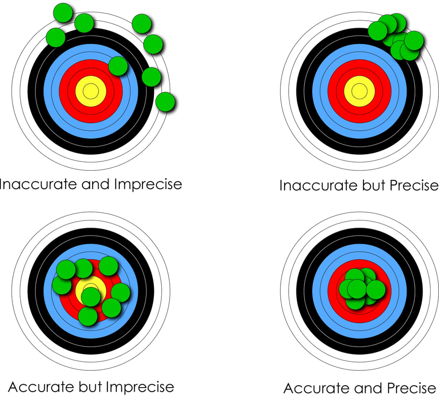
Figure 5. A graphical representation of the difference between accuracy and precision. This is something of a cliché but important to understand nonetheless
 |
Table 1 - Geographic precision. This is a simple numerical code that relates the precision with which a point location is known on a map. This allows poorly resolved data to be added to the database when no other data is available, which can be replaced when better location information is known (Markwick, 1996; Markwick and Lupia, 2002). Well data should always be of the highest precision, and indeed should be known within meters
Qualifying and quantifying confidence and uncertainty
Whilst analytical error is numeric, and sometimes we can assign quantitative values to position or time (± kilometers, meters, millions of years) this is not always possible. So another way to approach the challenge of recording confidence or uncertainty is to have the compiler assign a qualitative or semi-quantitative assessment.
In our databases, we again follow some of the ideas outlined in Ziegler et al., (1985), Markwick and Lupia (2001), Markwick (1996). These schemes are distinct from quoted analytical errors and are designed to give the user an easy-to-use ‘indication’ of uncertainty (Table 2).
In our databases, we again follow some of the ideas outlined in Ziegler et al., (1985), Markwick and Lupia (2001), Markwick (1996). These schemes are distinct from quoted analytical errors and are designed to give the user an easy-to-use ‘indication’ of uncertainty (Table 2).
Table 2. Explanation of confidence codes used for structural elements. The age dating confidence is based on the scheme described in Ziegler et al (1985)
The advantage of this approach is that it is simple, which encourages adoption. The disadvantage is that even with explanations of what each code represents (Table 2), there will be some user variation. Nonetheless, it provides an immediate indication of what the compiler believes, which can then be further explained in associated comments fields.
In map view, colors can be applied to give the users an immediate visualization of mapping or dating or other confidence depending on what the user needs to know. An example of the mapping confidence applied to structural elements is shown in figure 6. Confidence is further expressed visually using shading, dashed symbology, and line weighting (this is discussed in our database documentation and will be the focus of an article I am writing on drawing maps).
In map view, colors can be applied to give the users an immediate visualization of mapping or dating or other confidence depending on what the user needs to know. An example of the mapping confidence applied to structural elements is shown in figure 6. Confidence is further expressed visually using shading, dashed symbology, and line weighting (this is discussed in our database documentation and will be the focus of an article I am writing on drawing maps).
Figure 6 - A detailed view of the eastern branch of the East African Rift System in the neighborhood of Lake Turkana showing the structural elements from our global Structural Elements database (left) colored according to the assigned mapping confidence (right). The lower confidence assigned to features in the South Sudanese Cretaceous basins (just outside this extent) reflects the use of published maps as the source to constrain features. Although these interpretations may be quoted as based on seismic, as they are, the lack of supporting primary data relegates the confidence to category 2 or in some cases 1. Those upgraded to category 3, indicated by the light green colors, are supported by interpretations from primary sources, such as gravity or better quality seismic. The category 4 features (medium green) in this view are largely based on Landsat imagery constrained by other sources, such as high-resolution aeromagnetic data and seismicity. This gives the user an immediate indication of mapping confidence, which intentionally errs on the side of caution. Features can be upgraded as more data comes available
Do we capture all information?
By including fields for record confidence means that the database can be sorted (parsed) for good and bad ‘quality’ data.
Why is this important?
Why not do this on data entry?
You could, for example (and I know researchers who do this) make an a priori decision and remove all data that you believe is poor and not include this in the database.
But what if this ‘poor’ datum is the only datum for that area or of that type of data that you have? For example, in a spatial database, we may have a poorly constrained data point for a basin (we know its location to within 100 km, but no better), but no other data.
That data point is then important or could be, but is spatially poorly constrained – in this case, a low spatial precision.
We need to include this record in our database, because it is all we have. But we need to ensure that the record is audited to reflect the uncertainty in its location.
A priori decisions on which data to include in our database based on an initial assessment of data confidence are therefore to be avoided:
- This may be all we have
- This may point us to where we need to actively find more data
- You can improve/update/replace that datum as better information becomes available – as long as you have attributed correctly
Who are the database builders?
Given how much information we need to record to qualify our data, it will come as no surprise that data entry compliance is a major difficulty.
Database population is very tedious. This can result in errors, or short-cuts being taken, or worse.
As an example of what can happen, I had one senior geologist, who will remain nameless, point-blank refuse to attribute his interpretations, stating that GIS and attribution “were beneath him”. After pressure, he acquiesced. But during my QC stage, I found that in a fit of pique he had copied and pasted the same attribution for all records – assigning “Landsat imagery” as the source for submarine features was a bit of a giveaway! All of his work had to be redone, by me as it happened…
This case highlights a serious challenge, to get staff to realize the importance of the audit trail and to fill in these fields.
From my experience let me suggest four ways you can do this (other than threats):
The solution here is to recognize that technology is there to help you reach answers by removing the most tedious repetitive tasks, and analyzing and managing large datasets. But we must never forget that we still need to know our data. It is a truism that the more remote we get from our data the least likely we are to understand any answers our AI system gives us.
We also need to remember that databases are ‘living’ in the sense that you cannot, should not simply populate a database and walk away, but recognize that you need to update and add to your database as more information becomes available.
Database population is very tedious. This can result in errors, or short-cuts being taken, or worse.
As an example of what can happen, I had one senior geologist, who will remain nameless, point-blank refuse to attribute his interpretations, stating that GIS and attribution “were beneath him”. After pressure, he acquiesced. But during my QC stage, I found that in a fit of pique he had copied and pasted the same attribution for all records – assigning “Landsat imagery” as the source for submarine features was a bit of a giveaway! All of his work had to be redone, by me as it happened…
This case highlights a serious challenge, to get staff to realize the importance of the audit trail and to fill in these fields.
From my experience let me suggest four ways you can do this (other than threats):
- Make data entry as clear and as simple as possible. This goes back to something that my friend Richard Lupia and I wrote back in Chicago, that a “database needs to be simple enough to be used, but comprehensive enough to be useful”.
- Have the data entry teamwork with and update an existing dataset. When faced with a previous entry that does not have enough information to make a decision the new compiler will, hopefully, realize how important including that sort of information is. A common problem is that the data entry team does not use the data. They, therefore, do not have a vested interest in it. Ideally, you need everyone involved in all steps.
- A rigorous QC workflow – this was something we had at BP when I was an intern spending seven weeks entering data into a wells database. In the late 1980s, this was entered by line code… After completion, the well log was printed and checked by hand by a more senior biostratigrapher. Given this was a bed-by-bed database you can imagine the time and work needed to check every entry. But it was critical
- Automated QC – design the database so the fields have to be filled in. Dropdown menus, limited options.
- Automated data entry. For some types of data, this makes sense - capturing data tables -, but care must still be taken. Other automated techniques, such as lineament analysis in structural element mapping are useful to help systematically identify patterns but also can lead to a mess. Such methods still need human interrogation.
The solution here is to recognize that technology is there to help you reach answers by removing the most tedious repetitive tasks, and analyzing and managing large datasets. But we must never forget that we still need to know our data. It is a truism that the more remote we get from our data the least likely we are to understand any answers our AI system gives us.
We also need to remember that databases are ‘living’ in the sense that you cannot, should not simply populate a database and walk away, but recognize that you need to update and add to your database as more information becomes available.
It is about knowing your data
There is no question that AI and machine learning have much to offer us in data science. But where I worry a little, or perhaps more than a little, about AI is how it is being perceived in many companies as a black-box solution to the problem of big data.
We as users need to have enough knowledge to understand the answers such systems give us, but more importantly, as I hope I have demonstrated here in this brief introduction, we need to ensure that we know where our data has come from and that we trust it. This is not just in the sense of computer verification, but in constraining the nature of the original data itself, how it is recorded, how confident we can be with this recording.
This process of qualifying and auditing data is admittedly laborious as my examples of solutions show, but I hope you will have seen how powerful even the simplest schemes can be when used systematically.
A pdf version of this blog is available here for download.
Postscript
As some of the more observant readers will have noticed the sediment in the picture at the beginning of this article is not clay, but sand.
As I have emphasized throughout, you need to know your data – be careful what you build from
As I have emphasized throughout, you need to know your data – be careful what you build from
References cited
Callegaro, M. & Yang, Y. 2018. 23. The role of surveys in the era of "Big Data". In The Palgrave Handbook of Survey Research eds D. L. Vannette and J. A. Krosnick). pp. 175-91.
Damsté, J. S. S., Kenig, F., Koopmans, M. P., Köster, J., Schouten, S., Hayes, J. M. & Leeuw, J. W. d. 1995. Evidence for gammacerane as an indicator of water column stratification. Geochemica et Cosmochimica Acta 59, 1895-900.
Markwick, P. J. 1996. Late Cretaceous to Pleistocene climates: nature of the transition from a 'hot-house' to an 'ice-house' world. In Geophysical Sciences p. 1197. Chicago: The University of Chicago.
Markwick, P. J. & Lupia, R. 2002. Palaeontological databases for palaeobiogeography, palaeoecology and biodiversity: a question of scale. In Palaeobiogeography and biodiversity change: a comparison of the Ordovician and Mesozoic-Cenozoic radiations eds J. A. Crame and A. W. Owen). pp. 169-74. London: Geological Society, London.
O'Neill, R. V. & King, A. W. 1998. Homage to St. Michael or why are there so many books on scale? In Ecological Scale, Theory and Applications eds D. L. Peterson and V. T. Parker). pp. 3-15. New York: Columbia University Press.
Peters, K. E., Walters, C. C. & Moldowan, J. M. 2007. The biomarker guide. Volume 2. Biomarkers and isotopes in petroleum systems and Earth history, 2nd ed.: Cambridge University Press, 704 pp.
Philp, R. P. & Lewis, C. A. 1987. Organic geochemistry of biomarkers. Annual Review of Earth and Planetary Sciences 15, 363-95.
Samuel, A. 1959. Some Studies in Machine Learning Using the Game of Checkers. IBM Journal of Research and Development 3, 211-29.
Ziegler, A. M., Rowley, D. B., Lottes, A. L., Sahagian, D. L., Hulver, M. L. & Gierlowski, T. C. 1985. Paleogeographic interpretation: with an example from the Mid-Cretaceous. Annual Review of Earth and Planetary Sciences 13, 385-425.
“Alexanders is closed” What next for exploration?
I thought I was being very organized last winter as I built up a portfolio of blogs and articles to provide myself with materials to post during 2020. What a great idea! Planned commercial projects were coming in and I knew that these would take up much of my time. Even as news of the epidemic filtered out of China in January, there was a sense that this was to be a repeat of SARS. But as I got ready to post today’s article at the end of February, the news from northern Italy showed all too clearly that this coronavirus had spread beyond China and that this was not going to follow the geographic limits of its predecessor SARS. It is ironic, that this blog is about a changing exploration industry. And now five months later, everything has changed. But in re-reading what I wrote I believe it is still a relevant discussion. So...

Houston: Cowboys, oil, alligators, and steak… A world that has gone? Should go? Or is it just on hold? Your answer will depend on your politics and vision of the future. Whatever your view, the world is certainly changing, and that change needs to be managed. So, what next? Or do we just wait and see what happens? That might work for some… in the swamp…
The sign on the door was clear, “Alexanders is closed”. It was April 2017 and after 10 hours on an economy flight from London, it was not what I wanted to see. But the reality was there for all to read.
Alexander's restaurant (http://jalexanders.com) at the corner of Westheimer and Wilcrest had long been my refuge. It had been there for as long as I had been visiting Houston. First as Houstons then as Alexanders. A place to relax and think, to meet with friends, enjoy a steak after a long flight or a days’ meetings.
My usual dilemma was whether to go for their ‘famous’ baby back ribs or the filet mignon with a béarnaise sauce. Then there was their “vegetable of the day” of which the sautéed spinach, creamed spinach, grilled zucchini, and beefsteak tomatoes are, or rather were, worthy of note.
The baked potato fully loaded was usually a step too far as I saved myself for their wonderful carrot cake. So moist. So bad...
And now it was gone…
Whilst for many of you the closure of Alexanders is completely inconsequential, especially now, and indeed most of you have probably never heard of Alexanders, for me, it was yet more evidence of changing times and the loss of reassuring certainties. Little did I know…
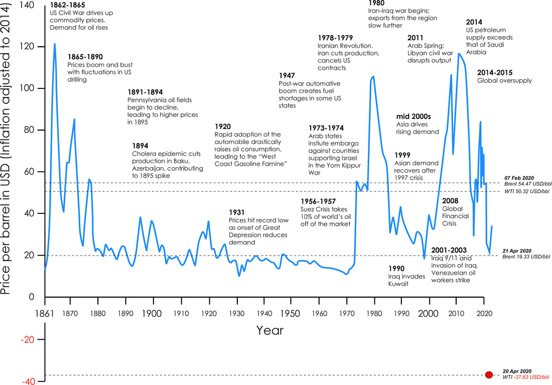
This graph is based on that shown on the World Economic Forum website in 2016 https://www.weforum.org/agenda/2016/12/155-years-of-oil-prices-in-one-chart/) modified to include more recent changes (from Bloomberg). The original version of the graph is cited as Goldman Sachs (see additional references on the weforum page). The fluctuations in prices are clear, especially over the last 40 years
There are cycles and there are cycles...
The oil and gas industry has always been cyclic and many of us have seen many - far too many - downturns and recoveries. Indeed, many old-timers seem to keep track of their careers by the number of downturns they have seen and survived.
Each recovery in the past has seen an increase in budgets and a major hiring drive, as business returned to 'normal'.
But the last downturn has been different, starting in 2014, and now exacerbated by the consequences of COVID-19.
Yes, we as an industry are faced by many challenges, not least the transition from fossil fuels to a more diversified energy portfolio, the vagaries of unconventionals or the political game playing between the worlds leading oil producing countries. Each deserves a blog in its own right.
But the change that concerns me the most, and which I think will have the biggest ramifications not only for our industry but for Earth education in general, is the loss of experience.
The Alamo, San Antonio. A metaphor for our industry? No.
Changing demographics: the good, the bad, and the seriously worrying…
As I walked around last year’s AAPG convention in San Antonio I was struck by the greater number of young geologists and the broader diversity of attendees than in previous years.
This was great to see. Change is happening and it is no bad thing.
But with all the new faces there was also the demonstrable absence of old faces and with that experience and expertise.
it is true that each past downturn has resulted in a gap or pause in the staff demographics as potential graduates looked at what was happening and opted for different careers. The resulting demographic imbalance has been long recognized, and many, if not most companies were actively addressing this through mentoring, knowledge transfer, and digital knowledge and database systems.
But the depth and extent of this last downturn have left this process of knowledge transfer incomplete.
More significantly, it has seen a generation of experience opt for early retirement and a younger generation who are increasingly deciding against the Earth sciences. This has been compounded by a general reticence to hire significantly this time given uncertainty over the future.
The question is, have we lost so much of our experience in this last downturn that this will affect our recovery as an industry and especially our ability to brainstorm and solve the challenges that now face us?
An industry of the brightest scientists and engineers…
Our industry can boast some of the brightest scientists and engineers of the 20th and 21st centuries.
We have been at the forefront of increasing the understanding of our planet from tectonics, to depositional processes to paleontology and beyond.
Our industry has developed and build technologies and tools that can send sound waves into the Earth to resolve the structure of the subsurface even down to the Moho (the base of the crust) and can now drill through kilometers of rock from rigs sited in two kilometers of water and still know where the drill head is within meters. That is quite incredible. Well, I am still impressed
This is something that we should be extremely proud of. Achievements that we should shout about far more than we do.
The new generation is equally gifted, if not more so. I have been lucky to hire and work with many excellent young geologists. But they would be even better with mentoring from and access to experienced staff. But those experienced staff have either left or are about to leave the Industry. (As I was about to post this article, I received an e-mail from a friend in Houston who had just announced that she was leaving the Industry. Carmen is one of the most impressive scientists I have worked with and a great role model for the next generation and especially the growing number of young women joining the industry. Her departure is a devastating loss and one the Industry can ill-afford).
Experience is key!
This is all the more important as we apply our industry’s skill-base to energy transition and building new business models.
Experience is about having seen numerous real-world examples and being able to draw on these when making decisions, warts, and all. Knowing what worked, what failed, and why.
As my Ph.D. advisor repeatedly told me "the best geologists are those who have seen the most rocks". (I am convinced that this is something said by every Ph.D. advisor to every geology Ph.D. student, but that makes it no less true).
And that places us in something of a cleft stick.
On the one hand, the Industry is addressing past diversity issues and hiring a new generation of enthusiastic, talented, Earth scientists, albeit in limited numbers. Whilst simultaneously cutting costs. Great…
But, on the other hand, we have lost the experience and expertise we need to both mentor the next generation and also to make informed decisions as we start to explore once more.
So, what to do?
Let me respectfully offer a few suggestions:

1. Make more from what you have
Today companies have libraries filled with 3rd party reports, internal studies, presentations, and databases. That is an incredibly powerful resource, but only if used.
The challenge is to understand what you have and how to integrate this within your current workflows. What data and knowledge are good? What is bad? What can you accept and what should you ignore? It is certainly advantageous to know where the skeletons are before you repeat past mistakes! Mistakes cost time and monies.
Why spend more monies if you already have the answers, or resources to get to the answers, in-house?
An easy win is to get your libraries curated and databased. In some companies, this has already been done. It is something I spent 2019 doing with my libraries (see my blog on scanning)
Another solution is to bring in the original product builders and get them to explain what they did and where useful, updating their products to fit new corporate workflows. This is certainly where much of my time would have been focussed this year (until some errant RNA intervened), having spent the last 25 years designing, building, and selling products and solutions to exploration companies.
One problem with seeking out the builders is that whilst their companies may still exist (possibly) the authors themselves may have moved on.
The same is true when looking for your own staff who made the original purchases with a specific plan in mind and/or who used the products. You may need to visit the golf courses of Houston or drive out to the Hill Country (though obviously not Alexanders) – ‘social distancing’ notwithstanding.
Many of you may have access to the excellent global resources that are now available. I was privileged to be instrumental in the development of several of these, working and building some great teams. The challenge, as an exploration group, is how to get more from these. They each have their own strengths, and each was designed for slightly different purposes. What do you need to know to unleash their potential? Feel free to drop me a line. This image is based on my 2019 paper and 30 years of research and experience
2. Strengthen relationships with University research groups
University research groups have always been a great source of cutting-edge ideas, knowledge, understanding, and data. Not to mention future staff.
With down-sizing and the disappearance of company-based research groups, universities are becoming all the more important.
This is not just about bringing in a professor to give a one-off seminar, but from my experience is best achieved through more active participation through workshops, having academics work directly with teams, and through MSc and Ph.D. projects and internships.
As an example, last year I participated in a week-long workshop for a company that convened leading academics from different research groups and with varying opinions. In a few days, staff were exposed to all the views and background from the leaders in the field, something that would have taken them months to get a handle on by only reading their papers, and which even then, would not have provided the insights into the mindsets of the protagonists.
(There is also a need to maintain a presence in Academia at a time when our industry is increasingly perceived negatively).
3. Go back to the basics.
Get out the pencil crayons.
Get your young staff to look at paper copies of seismic and use colored pencils to identify horizons. The key is to encourage your teams to understand the data, know their data, and to ask questions. They should not be afraid to disagree with their elders, but wise enough to know that experience can be an advantage. We are not infallible, but we have seen more rocks and solved more problems.
Get your young staff to look at paper copies of seismic and use colored pencils to identify horizons. The key is to encourage your teams to understand the data, know their data, and to ask questions. They should not be afraid to disagree with their elders, but wise enough to know that experience can be an advantage. We are not infallible, but we have seen more rocks and solved more problems.
4. Understand the whole system, what to ask, who to ask and where to find solutions.
With fewer staff and the disappearance of the armies of specialists we used to have, it is key that the next generation knows how the Earth system fits together.
This does not mean going all "fruit salad" (my thanks again to Catherine for that wonderful imagery), in which our staff have a little bit of knowledge of everything but no real depth.
This is about ensuring that our teams know the vocabulary and key headlines of diverse scientific fields and most importantly that they know enough to be able to ask the right questions and know whom to ask or where to search for the answers.
A picture I have used many times, but no less relevant for its repetition. When we consider any problem to do with the Earth system, whether in exploration or environmental change, we have so many components to think about. There is simply so much to take in! Where do we start
5. Do not assume that technology will solve everything…
Over the last three years, advances in machine learning and AI have been impressive.
Pattern recognition has indeed been around for many decades: auto-trace in seismic interpretation, or computerized fossil recognition in biostratigraphy. The limitation in the past was largely computer processing power, which is no longer such an issue.
With data storage now relatively cheap, and especially the development of cloud storage, accessing data and knowledge from anywhere in the world should be child’s play.
The problem is that whilst a child can operate an iPad with ease from kindergarten on, if not before, and they are incredibly computer savvy, they do not necessarily know the questions to ask. That comes with experience and does not seem to be always taught. As evidence ask them to do a Google search and see what they find; I am always amazed at what people do not find.
Technology is wonderful, and I am a self-confessed addict having designed, built, managed and analysed computer-based databases for over 30 years. But don't forget the basics - ask questions, know your data, question everything.
Operationally what should we do?
Well that is your call, but let me suggest the following:
- databasing and data management – curating your data and knowledge so it can be assessed, accessed and analyzed;
- work with data scientists, who can help design systems that make that data more accessible and program the systems to help us find patterns and get the most from it;
- have the data scientists work in the same teams as the geoscientists, who know the questions to ask and the significance of the results.
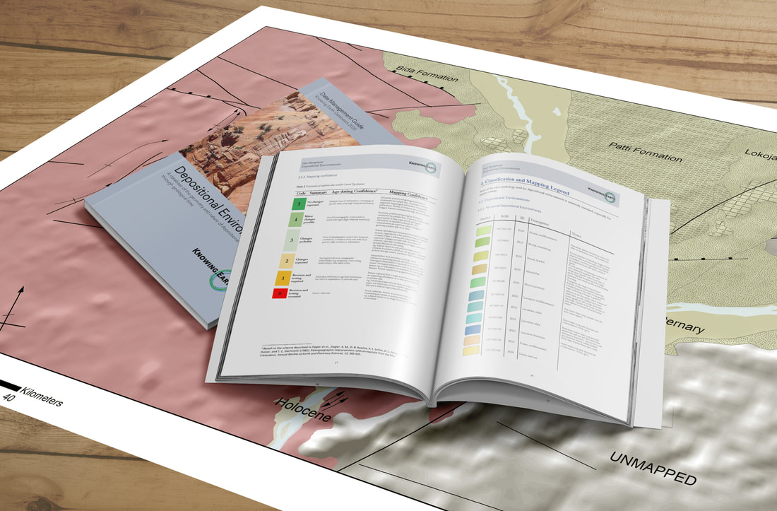
I have spent much of my career designing, building, and managing large, global databases. Key to their success is knowing where the data has come from, what can be used, and what should be thrown the trash or used with caution. There is a fundamental difference between data and verified data. One is a collection of words and numbers, the other is power.
So, where next?
The future is about preparing our new generations of Earth scientists with all that we have learned over the last century or more, what worked, what failed, and why. To know the questions to ask and where and how to find the answers.
The next generation of Earth scientists needs to be well-grounded in the fundamentals of geology and the scientific method.
At the same time, they need to be conversant with a broad range of scientific fields, or at least enough to know the vocabulary of diverse fields and how each discipline might impact the problem they are trying to solve.
This also gives them transferrable skills that will aid the energy industry as we transition to alternative sources of energy, but also enable them to look at applying their expertise and experience to a range of other challenges, from the management of water resources to carbon capture, and storage (CCS), to geothermal energy, mineral exploration and waste management.
They need to be familiar with the tools available, but not to assume they these will solve all the problems they find.
At the end of the day, we need to harness all that we have learned in our industry to accelerate the next generation in understanding even more than we do for the betterment of mankind.
Understanding the Earth is what we do!
Epilogue. What happened to Alexanders?
A search on the internet revealed that Alexanders Westchase closed at the end of January 2017 on the very same day that I had left my role as Technical Director of an Aim-listed consultancy after 12 years of successfully building the business. Coincidence I am sure…Rule #39 notwithstanding..
Today, what was once Alexanders in Westchase, Houston, is the site of a 24-hour emergency center. Useful and admirable, especially right now. Though I won't be going there for steak
"Alexanders is closed". All change.
Today, what was once Alexanders in Westchase, Houston, is the site of a 24-hour emergency center. Useful and admirable, especially right now. Though I won't be going there for steak
"Alexanders is closed". All change.

Useful and admirable, but not quite the dining experience I was expecting. Image from Google Streetview. What would we do without Google?
A pdf version of this blog is available here for download

Business ‘success’ very much depends on your measure of ‘success’. For some people that measure might be making large profits or growing the market value of their company. For others, it may be the physical size of their business in terms of the number of staff or offices. Whilst for others success is about being recognized for the quality of their services and products. Whichever of these metrics you chose defines your business’s culture and values and is largely dictated by the CEO.
There are numerous websites with business tips for success. Most are useful. But, which one is most appropriate for your business will depend on the industry you are in and what is important to you personally.
Below are my recommendations for success based on over 30 years’ experience in the oil and gas industry and over 10 years as an executive director of a highly successful, AIM-listed natural resources service company based in the UK.
Although my experience has been with running knowledge-based companies, with their dependence on translating creativity, ideas, and scientific excellence into income, most of the lessons I have learned may be applied to all businesses.
I hope you find this of use.
1. Be passionate about what you do
To be successful you need to be passionate about what you do. You need to care about your business, what it produces and what it stands for. This means having a vision for what you want to achieve and how it will change the world.
Once you stop caring about what you do, and your company becomes “9 to 5”, then it is time leave and do something different.
It is true that passionate leaders can be difficult to work with. An often-quoted example is the late Steve Jobs. Brilliant, driven and, by most accounts a pain in the butt to work with. But he changed the way we work and communicate, created some of the most beautiful and desirable products ever conceived, whilst simultaneous building the most valuable company in the world from the seemingly inescapable mire of the Macbook 5300 in the mid-1990s (I had one, I know how bad it got...).
Can you be passionate without being an a**e? Of course, you can.
2. Make sure you have the right team
Having the right team is critical. If you don’t then you will find yourself spending too much time worrying about what they are doing, running around retrospectively cleaning up ‘their’ mess and not having time to do what is important.
As an executive, this is totally in your hands. You are the one in control of hiring. Or, at least, you should be. If you are not, then either change this or get out quickly.
If the person you are interviewing does not meet your criteria, or you are not sure they do, then recast the net and look for someone who does.
In my experience you are far better off having a small team of like-minded, passionate people, then a big team of not so right people working 9 to 5.
Once you have the right team then you need to keep them. How you do this will depend on the individuals concerned. You will need to ensure you understand their needs and ambitions. If not, you will lose them.
But be prepared. Even the best team’s break-up eventually.
3. Know what you believe
What is your story? Why are you doing this?
Mission statements have become something of a “must-have” for all companies. Sadly, a quick search online would suggest that most mission statements come from the same source and I do wonder if there is an automatic mission statement generator out here.
This is a shame, because if all the companies truly believed in what they stated they believed in, then the world would be a much better place.
Personally, I would find it refreshing if companies included their real missions: “The mission of company X is to make heaps of cash, whatever it takes”.
That has the appeal of honesty and transparency, whilst also being quite disturbing to my liberal, albeit globalist, capitalist sensitivities. Yes, you can be a liberal-minded capitalist!
It comes down to what we, as individuals believe, and how we then communicate this to our staff and our company. This is not easy.
Perhaps the first question to ask is why do some of us work 24/7 for a business?
In most cases, it is because we love what we do, and we want the business to be successful, and for some of us because we have broader ambitions to change the world and make it better for future generations.
For me, the ‘best’ companies are those who strive to change the world we live in. Either at the day-to-day scale of providing a great service or environment, such as a wonderful evening at your favorite restaurant. Or the more grandiose ambitions such as those of Google, with their (possibly anecdotal) aim of making “all knowledge one click away” (although I now find this has changed as you will see from the link), or the original Body Shop, set up the late Anita Roddick and its concern for animal welfare (no animal testing). The mission statement I like best, because the company follows up on what it says, is that of the outdoor clothing company Patagonia, “Build the best product, cause no unnecessary harm, use business to inspire and implement solutions to the environmental crisis”.
What your ambition is will affect what business you establish as well as its mission statement.
If, on the other hand, your ambition is simply to climb as high and as fast up the corporate ladder as you can, grabbing as many monies and perceived attention on the way as possible, then frankly which type of company you manage is completely immaterial. Though I can assure you, it will not be one of mine.
Mission statements have become something of a “must-have” for all companies. Sadly, a quick search online would suggest that most mission statements come from the same source and I do wonder if there is an automatic mission statement generator out here.
This is a shame, because if all the companies truly believed in what they stated they believed in, then the world would be a much better place.
Personally, I would find it refreshing if companies included their real missions: “The mission of company X is to make heaps of cash, whatever it takes”.
That has the appeal of honesty and transparency, whilst also being quite disturbing to my liberal, albeit globalist, capitalist sensitivities. Yes, you can be a liberal-minded capitalist!
It comes down to what we, as individuals believe, and how we then communicate this to our staff and our company. This is not easy.
Perhaps the first question to ask is why do some of us work 24/7 for a business?
- Because we like working?
- Because we want the monies?
- Because we want to change the world?
- Because we enjoy the scientific challenge?
- Because we have no other social outlet?
In most cases, it is because we love what we do, and we want the business to be successful, and for some of us because we have broader ambitions to change the world and make it better for future generations.
For me, the ‘best’ companies are those who strive to change the world we live in. Either at the day-to-day scale of providing a great service or environment, such as a wonderful evening at your favorite restaurant. Or the more grandiose ambitions such as those of Google, with their (possibly anecdotal) aim of making “all knowledge one click away” (although I now find this has changed as you will see from the link), or the original Body Shop, set up the late Anita Roddick and its concern for animal welfare (no animal testing). The mission statement I like best, because the company follows up on what it says, is that of the outdoor clothing company Patagonia, “Build the best product, cause no unnecessary harm, use business to inspire and implement solutions to the environmental crisis”.
What your ambition is will affect what business you establish as well as its mission statement.
If, on the other hand, your ambition is simply to climb as high and as fast up the corporate ladder as you can, grabbing as many monies and perceived attention on the way as possible, then frankly which type of company you manage is completely immaterial. Though I can assure you, it will not be one of mine.
4. Understand your business
Being passionate about what you do is critical, but if you are going to make a success of your business, you also need to understand what that business is. This may seem like a 'no-brainer', but there are too many examples of senior management brought into companies to 'save them' or take the company 'to the next level', who simply have no idea of the business they are trying to save.
The best way to be sure of your business story is to make this as succinct as possible. The most commonly used approached, and the one I like is to use, is the "elevator pitch" where you have 2 minutes and 10 floors in which to explain to someone what your business is and does and why they should call you.
A cliché? Absolutely. Good advice? You bet.
5. Understand your clients
There are few companies that can dictate to their clients what they, the clients, want and get away with it. Apple is, again, probably the stand-out exception.
Most companies respond to their clients, they are reactive. This is not necessarily bad, but it can mean that you are constantly playing catch-up as client needs change. This is increasingly true in the modern age of mass communication and social media with its immediacy and ever-accelerating change.
To make this work you need to understand both your own business and products (it is rather difficult to know how you can help your clients if you don’t know your own business) as well as that of your clients.
In knowledge-based consultancy, this is about doing your homework on the background to a problem that might affect a particular client. But it is also about being competent and trusted enough by your client to be able to provide them with advice and guidance when they don't know what they want and need.
To get to this point nothing beats face-to-face meetings, especially brainstorming sessions to define the problem and identify potential solutions.
6. Play to your strengths
One of my longstanding clients reiterated to me at almost every meeting over 20 years to “play to your strengths”.
Of course, this was as much about what they needed than a piece of business advice. Companies need to trust their service providers, especially large organizations for whom switching to a new provider is extremely difficult.
As a business, you need to be known and trusted for something that clients can put their finger on. You need to be an expert in a particular field or provide a service you are renowned for.
This may seem contrary to the need for “flexibility” which features highly in most top 10 lists. Flexibility is certainly important (though not in my top 10). But for many companies talk of “flexibility” can really be a cover for “flakiness” and a lack of a strategic direction.
Once you have an established strength, then you can think about diversifying if that is your strategy.
7. Trust and relationships are important
Another cliché, but true none the less: business is about trust and relationships.
I recall a meeting in Ho Chi Minh City (Saigon) with one of the oil majors to whom I was trying to sell a particular scientific report. Well, I gave a presentation, got chatting and, as usual, I got carried away with the science. At the end of the meeting, I asked if they had all the information they needed. To which I was greeted with big smiles. I had indeed…
Sales is always that balance about being excited about the product and what it contains and not giving away the answers so that the client doesn’t need to buy the product…
What happened in this case? Well, the company bought the report, and then bought more and became one of our best clients. Why? Because they knew that when they needed to chat with an expert to get answers hey could trust they only needed to call.
Relationships and trust take years to build but can take only moments to destroy.
Whatever you do, don't intentionally destroy relationships. I have seen this happen and it is insane. If you are retreating (moving away from a particular business line or sector, for whatever reason), be very sure that the bridges you are burning may not be useful in the future when fortunes change, and you are on the advance.
8. Don't run out of cash
Most companies that fail do so because they simply run out of cash.
This need not reflect a lack of 'success', nor the lack of a strong order book, but more the case that you probably should have changed your Finance Director.
It is about managing one input, revenue, and one output, costs. For most knowledge-based companies, the biggest costs are staff, which is why it is so important to have the right team around you.
You need to have control of both sides of this equation. Revenue comes back to knowing your customers and cost comes down to then building the right products and doing so efficiently
9. Be organized
Being organized as a business includes both how the company is structured to how the business is run operationally - how you build your products (project management and workflows) and manage your data and knowledge (data management). These are inter-related and will directly impact your cost-base.
Keep your management structure simple, with few levels as possible. This will vary by business, but in knowledge-based consultancy remaining "hands-on" is often critical, since access to your most senior, experienced team members is what your clients expect and what they are paying for.
You then need the right staff around you, a good lieutenant you can trust, and good support staff.
Operationally, you need to implement a clear project management system. Everyone needs to know what they are doing, why they are doing it and how to do it.
Getting this right is surprisingly difficult. Most project management websites advocate getting everyone's input and 'buy-in' on project and management systems. This is great in theory but usually results in chaos. In reality, the best way to make a system work is to have that system in place before you hire your first staff. There will then be no arguments about implementation.
A major risk for companies, especially in today’s economy, is losing key staff. Capturing knowledge and understanding through digital workflows can mitigate this by building, what a former consultant of mine, referred to as a 'corporate brain'. This acts as the "how to" guides for any new staff, a reminder to existing staff and a springboard for developing new ideas and improvements if properly designed.
Despite what many people think and fear, a good project management system should never inhibit creativity, it should facilitate it.
(And don't forget to back up your computers!)
10. Have an exit plan
“All the world is a stage and the people merely players”. Good old Shakespeare. A line for every occasion. But like any actor, for a business leader, there is a best time to exit stage left.
Hanging on to your position by the fingernails is singularly unattractive.
The question of exit comes back to why you do the job and what you want to achieve. If it is simple monies and perceived prestige, then moving companies frequently is likely the best strategy – before you are found out.
If you care deeply about your business, staff, and clients, then it becomes much trickier and this is where you need to consider ensuring continuity and who you want to pass the baton to.
In knowledge-based companies, a common dilemma is that as you become more successful you move further and further away from the science and higher up the management ladder. This may not be what you want, nor what your clients want. The dilemma is that if you hand over to a new management team in order to focus on the science, you may find they have a different strategy and yourself out of a job.
Been there, done that!
Be prepared to make a choice.
Once you exit, walk away and don’t look back!
A pdf version of this blog is available here. PDF

| “Look on my Works, ye Mighty, and despair!” (Shelley, 1818) |
Dinner with the romantic poets in the early years of the 19th century must have been a bundle of laughs, as they wrestled with the transience of life and the realities of the industrial revolution. The world around them was rapidly changing in ways that few could comprehend, and that change was accelerating. The assurances and certainties of the past were gone as urbanization, technological advances and scientific questioning took hold. Faced with so much change the Romantics did what they could, which was a mix of getting very depressed, and writing about it, reminiscing about a past ‘golden age’, and writing about it, doing a runner to southern Europe, and writing about it, and seeking solace in various medicinal pick-me-ups (ok, drugs) to help them, well, write about it... As a consequence, and if nothing else, we do have a substantial literature on the impact of change in the early 19th century.
A fear of change is true for every generation. You only need to look at today’s newspapers, blogs, and social media to realize that it is as prevalent today as any age in the past.
Each generation always seems to reminisce about some past ‘golden age’.
The problem is that those ‘golden ages’ are never the same. If only people compared notes. Invariably, the ‘golden age’ is a period in their lives or past that they themselves barely remember or which they did not fully understand at the time.
As has been said by many others, those who always look back to a ‘golden age’ have truly awful memories.
The Romantics were no exception, as they tended to forget the realities of cabbage for dinner, unsanitary housing, and death by age 40, if you were lucky (the average age for the 16-18th centuries in England).
The reality is that for the majority, today’s industrialized, globalized, technological world is a better place to live, for all its faults. We live longer, eat better, have access to so much more data and knowledge at the click of a button. We can immediately call anywhere in the world on a mobile phone, which can also access the world’s libraries, tell us where we are at any time, direct us to the nearest café latte, hospital or meeting.
I for one have no wish to return to the 1970s, the 1950’s and certainly not the 18th or 19th centuries. For me, the golden age is what we aspire to build not a past age.
This is not to say that the present-day is not scary and that we should not be concerned about change.
The Industrial Revolution certainly scared the Romantics and raised in them some very important philosophical and moral questions that are just as valid today.
Not least amongst these was the question of technological advance and scientific inquiry driven “because we can” rather than “whether we should”. This was embodied in Mary Shelley’s “Frankenstein”. This book was purportedly the product of a competition to write the best horror story, between Mary, her husband Percy Shelley, Lord Byron and John Polidori whilst they spent the summer of 1816 on the shores of Lake Geneva, on their way south. But it is a far deeper piece of literature than just a piece of “horror” fiction and something that all scientists should read. When I was at Chicago, “Frankenstein” was still essential reading on their ground-breaking Western Civilization course, which I assume it still is.
There was also the question of permanence and through this, the question of what do each of us leave behind and does it matter? In short, how will we be remembered?
In his poem “Ozymandias”, from which the quote that leads this blog is taken, Shelley describes all that there is left to show of a once powerful king, as a metaphor for us all. “Look on my Works, ye Mighty, and despair!” Now, just ruins. And yet…
I was minded recently to think about this question by two conferences I attended 20 years part.
The first conference, back in 1998, was a GIS conference in Florence, Italy. The second, a meeting of paleoclimate specialists in Colorado in 2016.
Florence, 1998
It is hard not to attend a conference in Florence, especially one on maps. The atmosphere is heavy with the Renaissance, the libraries replete with ancient tomes and maps that are as much a work of beauty as of cartographic science. So ESRI Europe’s user group meeting in Florence could hardly fail, and it did not. The mix of academics, civil servants, decision makers, and industry specialists was stimulating. Through numerous conversations around posters and after talks I, for one, found solutions to some of the problems I was facing in petroleum exploration analytics, simply by seeing how other fields solved their problems.
But, one conversation, over canapés and prosecco, made me stop and think. It was with a senior European civil servant, whose name I cannot remember if I ever knew it, who was close to retirement and who made the following statement to me, “that in our careers we can only ever hope to achieve one major thing”.
I was relatively early in my own career and it left an impression. Could it be true?
His argument was not in terms of numbers of projects or papers completed, but that at the end of the day you will be remembered for one thing and one big thing only.
It is something that has stuck with me and something, to be honest, that at the time I did not believe at all
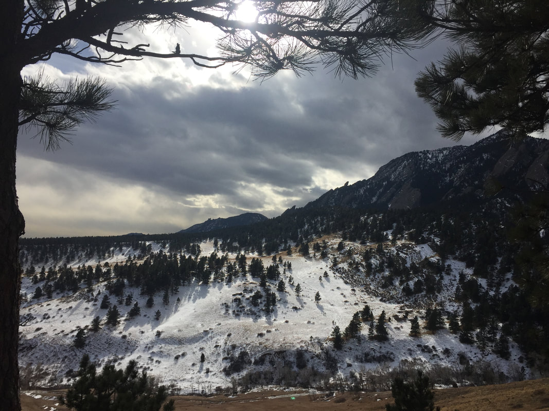
Roll on 20 years…. Boulder, 2016
I had been out of Academia for over 20 years when I was invited to attend a paleoclimate workshop in Boulder, Colorado in early 2016. An impressive list of attendees and great discussions followed over two days, which I found scientifically therapeutic and a serious wake-up call to tell me that I had been in management too long.
I also realized that I was getting old as I looked around and realized, to my chagrin, that the attendees who I thought were Ph.D. students were actually young professors - what they say about policemen looking younger and making you feel old, the same is true for professors!
But when one person told me how they had read my work and used it for years, I was gratified, reassured, flattered.
But the lingering question was this: was that my one achievement in my career that I would be remembered for? And that work was already 20 years old
2017. All change
A year later, and I found myself self-employed. As an executive director for 10 years, my focus had been on management, strategy, and marketing. But, now here was an opportunity to regain my academic ‘mojo’, to catch up on research, teaching and several decades of scientific papers. An almost impossible task. Thank goodness for Kimbo espresso coffee, good wine and a range of great cookbooks…
Now, after 24 months I have a major paper published, with several more on the way. New datasets in progress, a completely new data management system and suite of workflows, and an array of new ideas to promote. And most importantly, I have a reinvigorated curiosity about the Earth - my scientific ‘mojo’ is back.
In so doing I also found an answer to my question.
Are we limited to achieving only one big thing?
No. Of course not. We can always do more. It is about time and priorities. And therein lies the issue.
Once we get into our careers, where ever that takes us, time goes quickly. No sooner have we started then we are looking back. For me, it was when I was around 35. Next thing I knew I was close on 55.
There is also the problem that at the very point that we can contribute most to science given our experience, that experience takes us into management where we can no longer do the science. Something is wrong with that surely!
So, are there any lessons to learn that might help you if you are in the same position?
Let me suggest a few thoughts:
| 1. We are not limited to one ‘big thing’. It is about priorities and what is important to us at any specific point in our careers. Being remembered by posterity may not be one of those priorities. You need to chose what is important. What we leave, and its wider impact is up to us. 2. We always leave something for the next generation. We are all a consequence of our history and so in some way, everyone and everything that has preceded us has in some way shaped us, whether that past is physically preserved (as a paper, building or art) or not. After all, even in the case of Shelley’s Ozymandias, his statue was still there to find, and Shelley’s poem is still there to read. 3. Do now! If you are a scientist, get your research published. Don’t sit on ideas (been there, done that, and much of my work is still not published). 4. All things are transient. Accept it. This is just as true today as it was for Byron and Shelley. Change happens. It may appear faster today because of technology, but it was just as scary in the 19th century as now. To help, distinguish between technological change, the tools we use, and changing ideas. If you feel left out by Twitter, Facebook or Instagram, wait a few years and there will be something new anyway. More important is our changing understanding of the world; changing ideas. In this we should not be afraid to look to past thinkers for guidance. Problem-solving is timeless and many of those who have proceeded us have already asked similar or the same questions. But... 5. Don’t spend your life looking back. There is no such thing as a past ‘golden age’. The past can give us guidance through examples, good and bad. But take care, use the past, but don’t live in it. Time goes in one direction and if you are constantly living in the past, reminiscing about a golden age that is lost, you won’t see where you are going, and you certainly will not be able to use the lessons of the past to change the future for the better. |
Postscript
As for Shelley and his companions watching the sunset over Lake Geneva? It is sobering to think that within eight years of their writing competition in Switzerland, Percy Shelley, John Polidori, and Lord Byron would all be dead, and all at a young age, 29 (1822), 25 (1821) and 35 (1824), respectively.
Nothing is forever
A pdf version of this blog is available here. PDF
Paleogeographic maps come in a variety of forms. But it is as reconstructions of past landscapes that they are the most useful. Why? Because it is on these landscapes that the geological record is built. A particle sees topography, rivers, and oceans. It experiences rain and floods and the heat from the sun. It does not see mantle convection nor crustal hyper-extension nor differentiate between a compressional or extensional tectonic setting, at least not directly. How sediment is formed in the hinterland through weathering and erosion, transported and ultimately deposited is a function of what happens at the surface and therefore what that landscape is.
A Google search for the term "paleogeography" reveals a wide range of maps and images. From simple black and white sketches showing past shorelines to maps of depositional systems or the distribution of tectonic plates, to full-color renditions of paleo-elevation and -bathymetry. Many, if not most, are informative, some are aesthetically quite beautiful.
For most geologists, such maps need little introduction. They have a long history of usage in the literature, and today have become something approaching de rigueur for conference presentations and corporate montages.
But paleogeography is more than just images in presentations. It is or can be, a powerful tool for managing, analyzing and visualizing geological information, for investigating the juxtaposition and interaction of Earth processes, as well as acting as the boundary conditions for more advanced Earth system modeling with which to better understand how our planet works.
Over the next few months, I will present a series of blogs that will explore paleogeography.
It will be a journey that will take us through the history of paleogeography, a look at how maps are generated, a guide to some of the pitfalls and caveats of mapping, a review of some of the mapping tools available, as well as examples of how paleogeographic maps have been used to solve real-world problems, especially in resource exploration where I have the most experience.
It is a journey that I hope you enjoy and find useful.
In this first blog, I want to set the scene by addressing two simple questions. What is paleogeography? And why should you care?
The Nature of the Problem: there is simply so much to take in.
If we look at any landscape and the processes responsible for forming it and which are acting on it, such as in the central Pyrenees shown above, we are faced with something of a dilemma: There is simply so much to take in.
For example, if we are teaching field geology in such an area do we focus on the structural evolution, or the stratigraphy, or the depositional systems or the climate, or vegetation or any one of the many components that together comprise the Geological record and the Earth system in this view?
Or do we try and cover all the bases?
Ideally, we want to try and cover everything. But we have limited time. We also do not want to overwhelm all concerned with diverse technical vocabulary and concepts. The risk of losing our audience.
Consequently, we usually focus on a specific field of study.
The same is true in exploration. Whether we are assisting management to make strategic decisions about where to explore or are a member of an asset team identifying and evaluating blocks and then prospects. We need to understand all the components of the Earth system if we are to make informed decisions.
30 years ago, companies would have had an army of in-house specialists on whom they could call for help to do this, and even more academic experts on retainers. But, those days have long since gone.
Unfortunately, one thing that has not gone is the budget constraints of the commercial world.
Exploration is, by its very nature, a net cost to an energy exploration business.
So, in addition to the scientific challenges, in exploration, we are also faced with trying to extract the maximum value from limited budgets.
So, what do we do?
Finding solutions: Paleogeography as a key tool in the geologist’s toolbox
We need a tool with which we can bring together (gather), manage, visualize and interrogate diverse geological information, information which is often sparse (especially in frontier exploration areas), sometimes questionable, and often equivocal.
If we look to history for guidance, we find 19th-century geologists faced with the same problem. A growing volume of diverse geological information and how to deal with it.
Over the preceding 100 years, scientists had tried to encapsulate the contemporary knowledge of the Earth system into a single book or series of books. Humboldt's Cosmos or Lyell's Principles are examples. But this had become next to impossible by the middle of the 19th century due to the sheer volume of information, resulting in an exacerbation of the scientific specialism that we have today. Humboldt’s opus itself was unfinished at his death and completed based on his notes.
One solution to this problem was to use maps to distil visually this wealth of information. Ami Boué’s maps of the World, more commonly known through Alexander Keith Johnston's “Physical Atlas of Natural Phenomena” (Johnston, 1856) in the middle of the century., or Élisée Reclus’ excellent “The Earth” (Reclus, 1876)
Reclus’s book on the Earth (Reclus, 1876) included maps showing the distribution of mountains and volcanoes. With the distribution of seismicity and you have all the information necessary for plate tectonics
With geology, the problem was exacerbated by the time dimension. This was not simply a matter of mapping the current physical state of the Earth and its processes but how this had evolved over time. The past geography of the Earth. This is Paleogeography.
Paleogeography defined
It is no coincidence that Thomas Sterry Hunt, the author attributed with first coining the term “paleogeography”, was also one of the first petroleum geologists, looking for ways to manage and analyze geological data for exploration. (We will revisit this in a later blog).
Paleogeographic maps can summarise a wealth of geological information in a simple, visual way by distilling the record into representations of depositional environments and structures. This then allows additional information to be added and juxtapositions and relationships investigated.
Such maps can also show lithological distribution and character, although strictly speaking facies maps are distinct from paleogeography’s in that they represent the product of processes, i.e. the rock record (as do GDEs for that matter), whilst a paleogeography represents the environment and landscape in which and on which those processes act and upon which the geological record is built.
The late Ypresian paleogeography for the central Pyrenees showing one transport pathway that takes in the three outcrops shown.
From Markwick (2019)
From Markwick (2019)
In practice, this definition of paleogeography has become blurred. Facies maps, GDEs (Gross Depositional Environments), and plate reconstructions are all frequently referred to as “paleogeography”
The original definition of paleogeography proposed by Hunt was as a field within geology to describe the “geographical history” of the geological record, which to him included the depositional environments, such as deserts and seas (Hunt, 1873).
This view of paleogeography as being the representation of the depositional environments that comprise a landscape is useful for two important reasons.
First, because it allows us to distinguish between the landscape, the processes acting on the landscape, the processes that created the landscape, and the rock record that is the product of all of the above. This makes the Earth system more manageable. It also means that when building a map we can audit each step (something we will look at another time).
But second, it allows us to deconstruct what the rock record directly responds to. What is important to consider. Where we need to focus our time (and monies). If we think of a sedimentary particle formed in the hinterland through weathering and erosion, transported and ultimately deposited, what does it really ‘see’ (i.e. respond to – at the risk of personifying clastic particles too much). A particle sees topography, rivers, and oceans. It experiences rain and floods and the heat from the sun. It does not see mantle convection nor crustal hyper-extension nor differentiate between a compressional or extensional tectonic setting, at least not directly.
It responds to the contemporary landscape and the processes acting on it.
A particle eroded from the hinterland and transported to its depositional location responds on its journey to processes at the Earth surface
Paleogeography defined: the problem of time
We now need to add another component to our definition of what paleogeography is. And that is time.
This is something that was identified by Charles Schuchert, a professor at Yale and colleague of Joseph Barrell, one of the founders of modern stratigraphy.
We now need to add another component to our definition of what paleogeography is. And that is time.
This is something that was identified by Charles Schuchert, a professor at Yale and colleague of Joseph Barrell, one of the founders of modern stratigraphy.
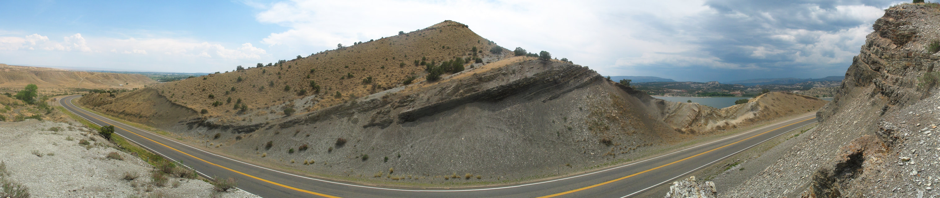
Cenomanian – Turonian section, Steinaker Reservoir. What would a Cretaceous paleogeography meaningfully represent? The transgressive shales or prograding sands or any range of other units through the Cretaceous
The Earth is dynamic and landscapes and depositional environments and their products the rock record can change over relatively limited geographic distances and short temporal intervals. For Schuchert, a global Cretaceous map was meaningless, for the very simple reason of what exactly did it represent? A landscape at the beginning of the Cretaceous, the end, the maximum extent of marine conditions, or as more likely, a pastiche of lots of different parts of that Cretaceous record? Schuchert’s recommendation was to use the finest stratigraphic intervals possible, which for him were represented by stratigraphic formations.
Kay went further to suggest that ideally paleogeography should represent a “moment in time”. Rather like looking at a satellite image. In this definition, paleogeography was a snapshot of the depositional environment and the landscapes at a specific moment. That makes perfect sense, but there is a problem. In the absence of a global correlation tool that can pick out a moment in time, this is next to impossible to achieve, especially over large distances. But it is an aspiration. It is also a reminder to ask of a map, what does it represent? Again, this is something we will return to in a later blog.
Kay went further to suggest that ideally paleogeography should represent a “moment in time”. Rather like looking at a satellite image. In this definition, paleogeography was a snapshot of the depositional environment and the landscapes at a specific moment. That makes perfect sense, but there is a problem. In the absence of a global correlation tool that can pick out a moment in time, this is next to impossible to achieve, especially over large distances. But it is an aspiration. It is also a reminder to ask of a map, what does it represent? Again, this is something we will return to in a later blog.
In summary
What is paleogeography?
Paleogeography is the representation of the past surface of the Earth, at a ‘moment’ in time.
Why is it important and why should you care?
Because it allows us to bring together diverse information that will help us better understand the Earth system, whether we are teaching in Spain or faced with deciding on where to explore. Paleogeography gives us the spatial context for gathering, managing, visualizing and analyzing a wide array of geological information in a way that is easy to digest.
At the end of the day, paleogeography is far more than just an image in a presentation.
This blog is one of a series based on a lecture course on paleogeography. Readers are also directed to a new paper on paleogeography published in the Geological Magazine: https://www.cambridge.org/core/journals/geological-magazine/article/palaeogeography-in-exploration/444CC2544340A699A01539A2D4C6E92A
A pdf version of this blog is available here. PDF
The Knowing Earth Review is an annual publication designed to provide Earth scientists and explorationists with an introduction to the Earth system. This is done through paleogeography, which provides the spatial and temporal context for gathering, managing, analysing and visualizing the diversity of components and processes that make up the system, and whose interaction shapes the Earth. This includes topics ranging from tectonics and mantle convection, crustal architecture and structure, paleogeographic mapping and depositional systems, Earth system modeling, drainage analysis and paleohydrology, lithofacies retrodiction and biodiversity.
This review may be especially useful for new staff and students who have not experienced the ‘big picture’ approach before, or for the coffee room to stimulate interest and discussion.
The 2019 edition will be released at AAPG 2019 in San Antonio.
The Review is freely distributed as a printed copy to sponsors of our partner university research groups and to clients of Knowing Earth.
The 2018 issue can now be downloaded for free as a pdf at the following location. PDF
2018 Edition Contents
Welcome to Knowing Earth
Editors Letter
Part of geology’s appeal is its breadth and diversity, bridging the divide between the humanities and the ‘pure’ sciences, borrowing elements from all. Whether we call ourselves ‘geologists’, ‘Earth scientists’ or ‘geoscientists’, the key to understanding the Earth is considering how all the components of the Earth system fit together, interact and evolve through time. But this breadth and diversity come at a cost and nowhere more so than when applied to oil and gas exploration.
How the Paleogeographic Atlas Project Redefined Paleogeographic Mapping and Big Data for Exploration
Fred Ziegler’s Paleogeographic Atlas Project was something of an oasis in a building that might otherwise be described diplomatically as architecturally ‘interesting’. If you have ever been to the Hinds building at The University of Chicago you will know what I mean. The office comprised a relatively large work area with three smaller annexes. Large wooden tables occupied the central space surrounded on all sides by shelves filled with books and papers arranged in alphabetical order, each paper in it is own manila folder, each carefully recorded in a reference database, a stamp on its cover to indicate the basics of what it contained. From the resulting databases and atlases, Fred and his team reconstructed past landscapes as paleogeographic maps, developing methods that still define much of how we do paleogeography today. But the Atlas Project also showed how to build, manage and analyze large geological databases. With ‘Big Data’ now prevalent throughout our industry, it is timely to look back to Chicago for some guidance
Revealing the Earth’s Architecture
When Thomas Sterry Hunt first coined the phrase “paleogeography” to describe the reconstruction of the Earth’s geography through time (Hunt, 1873), his workflow began with an understanding of what he referred to as the “architecture” of the Earth. By architecture, he was describing the Earth’s structural framework, crustal geometry and composition, and geodynamics, which today we define broadly within the concept of “Crustal Architecture”.
From Source to Sink: the Importance of Drainage Reconstruction
Source-to-sink has become a key concept in exploration, especially for understanding and predicting reservoir facies character and distribution. Source-to-sink follows the path of a particle from its formation through weathering in the basin hinterland, to burial and preservation in a sink area via erosion and transport (Martinsen et al., 2010; Sømme et al., 2009). This is a complex journey that requires an understanding of a wide range of subjects from tectonics to climate, weathering and erosion, transport mechanisms and depositional systems.
Modelling the Earth System for Exploration: why some Models are Useful
“All models are wrong, but some are useful”
George Box (Box and Draper, 1987)
George Box’s quote has become something of a cliché and one I have frequently heard when promoting the use of climate and lithofacies models in exploration over the past 20 years. Though the usual riposte I receive is with an emphasis on “all models are wrong”. The scepticism levelled especially at climate modelling has many ‘justifications’: “models are not data”, “there are too many uncertainties”, “yesterday’s weather forecast was wrong so how can I believe a climate model?”, “climate change is not real, so the models must be wrong”, “models are models”. Followed by the frequent question “do you have any seismic?”.
Bringing it all Together: the View from the Field
The 11th century Castillo de Samitier sits precariously upon a Paleocene limestone ridge some 450 metres high above the Río Cinca that winds its way south through the gorge below. All that remains of the ‘castle’ is a small chapel, the Ermita de San Emeterio y San Celedonio, and a single defensive tower, a second having long since fallen into the narrow gorge below. From the castle, you can see in one view how tectonics, landscape, climate, deposition interacted some 50 million years ago, and how they interact today. The view is breath-taking, but highlights a problem, there is simply so much to take in.
Creating a Legend
Maps are a means of visualizing spatial information. As such, they need a map legend that conveys that information through colour or ornamentation as simply and clearly as possible. In geology, there is a long tradition of colouring and coloured maps, with ‘relatively’ standardized symbologies for chronostratigraphy (geological time), structural elements and lithologies.
Further Information
Knowing Earth is about building partnerships and ensuring that all members have a common suite of baseline databases with which to build understanding. For further information, whether commercial or academic, please contact myself or my colleagues.
A pdf version of this blog is available here. PDF